Typeface Research
The three typefaces I have chosen to look at in further detail (i.e. who designed them, where they’re used etc) are:
– Chalet Comprime
– Avant Garde (Gothic)
– Times
Chalet Comprime
The Chalet Comprimé font was formed from the legacy left by French fashion designer René Chalet, and the font Chalet. ‘Comprimé is a family of three different weights in three styles plus a titling face—a total of 10 fonts. Over 100 silhouette images round out the collection. Typographers and designers alike will appreciate Comprimé’s compact yet uncompromising forms and its alternate character sets. From the clean to the capricious, Chalet Comprimé is an elegant typographical solution that will stand up to the aesthetic demands faced by today’s graphic artist.’ https://houseind.com/hi/chalet-comprime#
This is a relatively condensed font with different weights and variations, making it a very versatile font. Headings work especially well using and combination of the heavier and medium weight versions.
Avant Garde (Gothic)
‘Herb Lubalin and Tom Carnase designed Avant Garde around 1968. It was based on Lubalin’s logo for Avant Garde magazine. The original face was all uppercase. Avant Garde was the first typeface released by ITC when the company was founded in 1970. Next to being used in all types of art publications, Avant Garde was a classic in ’70s advertising design.
Additional versions include the condensed fonts which were created by Ed Benguiat.The OpenType version of Avant Garde Gothic Pro that was released in 2005 includes a suite of additional cap and lowercase alternates as well as new ligatures.’
‘Avant Garde is a display font, meant to be used for headlines and short texts. Use it if you need a retro 70’s look or want something that really stands out. It can be pretty difficult to actually use this font the way it was intended to be used. https://www.prepressure.com/fonts/interesting/avant-garde
Times
Times™ was named after the Times newspaper in the UK and was the result of a criticism made by renowned typographer Stanley Morison that the Times newspaper was outdated from a typographical perspective and that the paper was badly printed; all of which made the newspaper difficult to read.…
Extensive details on history and usage at https://www.fonts.com/font/linotype/times/story
Just about every publication has used Times at some time or another. Some publications use nothing else – many newspapers still use this workhorse of a font which can be found in nearly every corner of the world; from commercial publishing, book printing, through to business and personal communications Times is profoundly visible. Its inclusion as a standard printer font has broadened its application by being installed in the hardware of hundreds of millions of printers around the world.
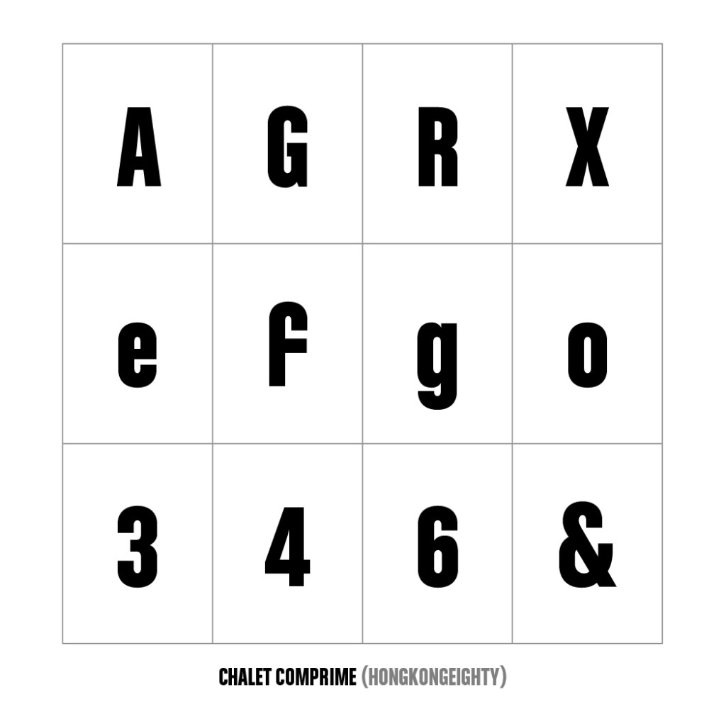
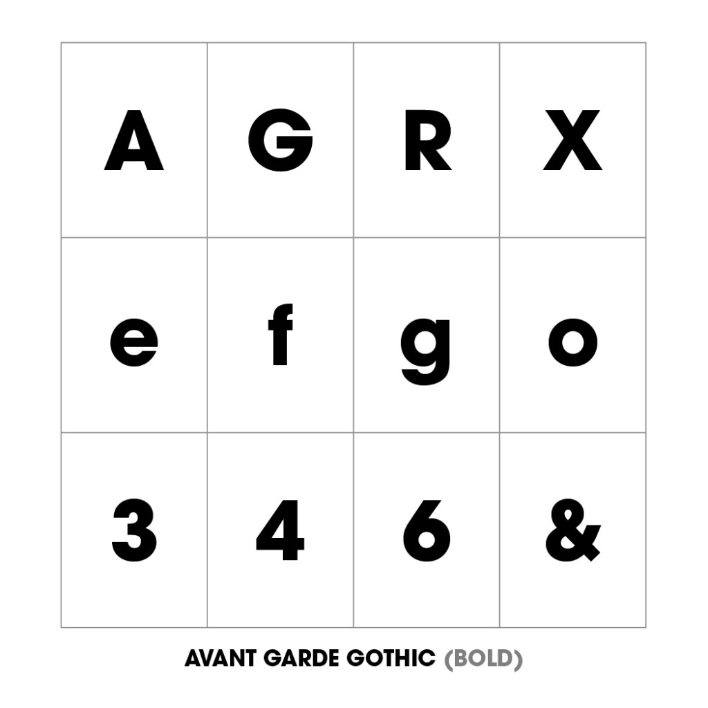
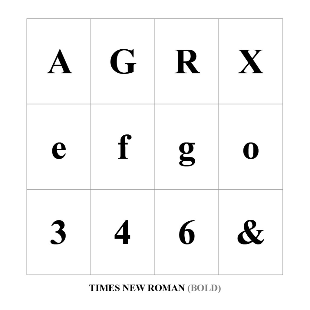
The three chosen fonts displayed above, all have a very unique style to them. Whilst all being the ‘Bold’ variation of each family, dimensions and weight all vary. I’d like to think all three are very usable in my work – with Times New Roman perhaps the only one I’d use for copy text.
