After exploring a few different patterns, each of varying style and colours, I decided that the most successful, in terms of doing the job intended – is the below:
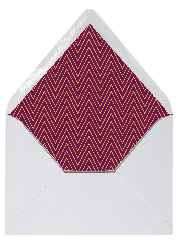
The combination of highly contrasting colours and a heavily repeated pattern, means that any information inside the envelope will be properly obscured. Its also a pattern that lends itself to a multitude of colours, which is ideal when being mass produced for a brand.
A close second was this effort:
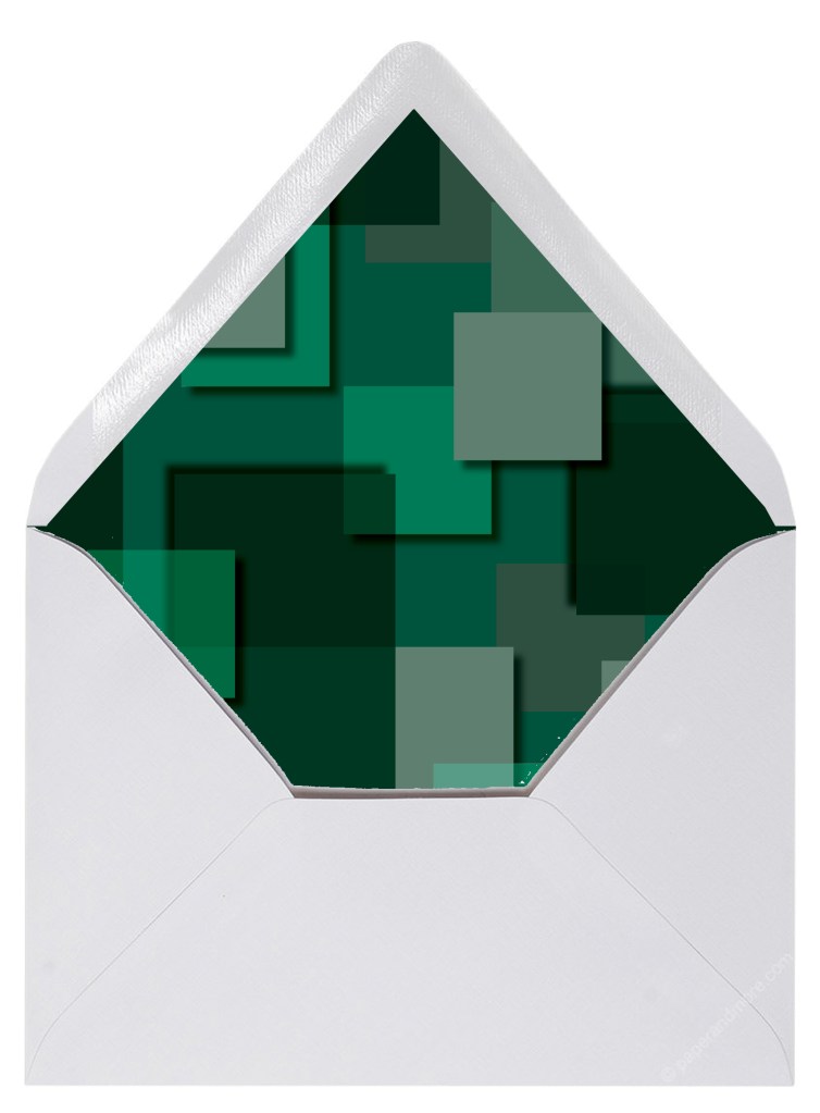
With added ‘layers’ through shadows etc, the obscurity is still present, but larger ‘blank’ areas mean that some may still appear, and that’s not ideal. Colour-wise it generally lends itself to a darker tone, thus limiting it’s appeal on a mass scale.
