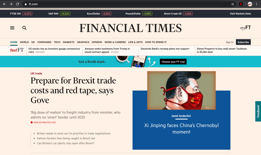
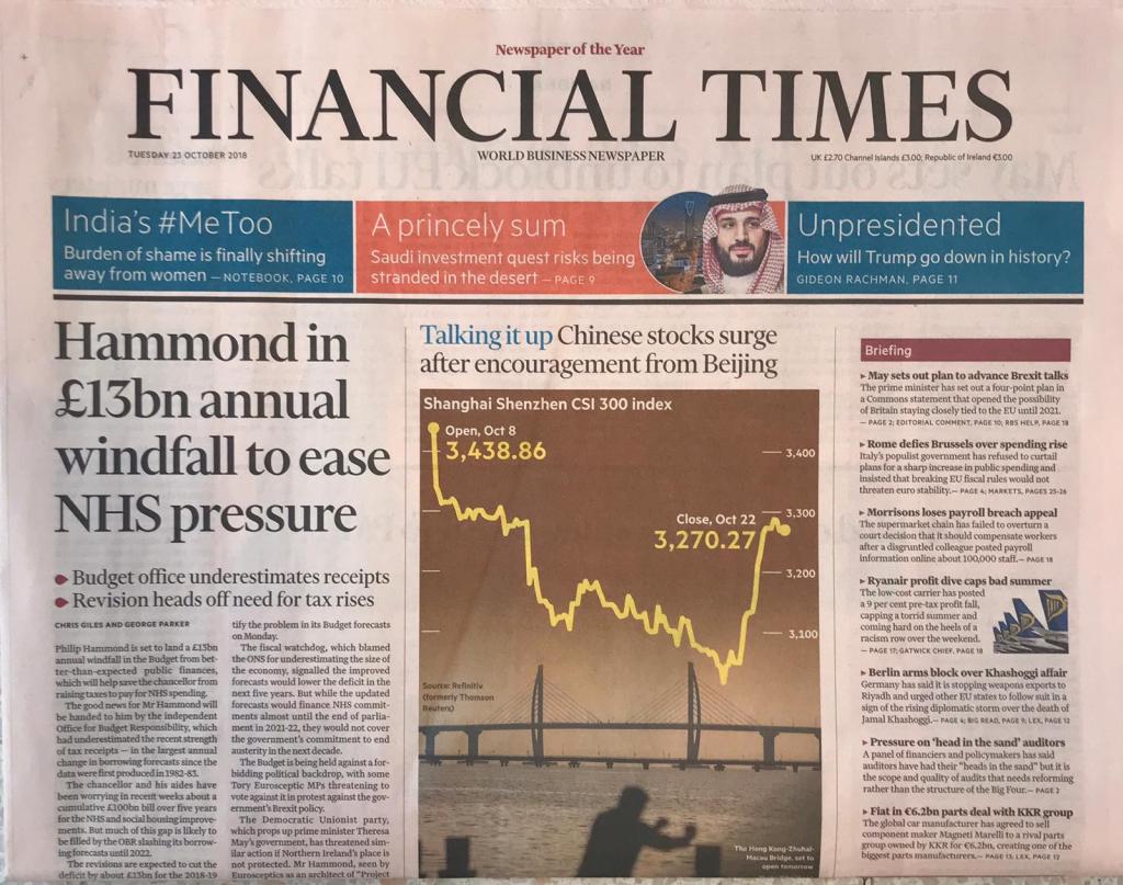
Starting with the Financial Times as a publication to focus on, I looked at how the website and physical paper compare. Firstly, the webpage: One of the first things I noted with the webpage that differs from the newspaper is the copy font. In the newspaper, a traditional serif font is used… however in digital form a more basic sans serif font is used, this is presumably to do with optimising it for web/screen, as it is far easier to read a sans serif font this way. In terms of things that were immediately similar, the obvious heading font was clear, to tie in the brand. Layout-wise though, the website obviously plays out differently, traditional columns are scraped in favour of user-friendly bitesized subheadings and an image which lead to the full story. Adverts are also prevalent, often in strips (vertical or horizontal) and fit in alongside the text, so as not to overpower the information. Similar to the main publication, the main or more important/breaking news articles are often bigger and in more dominant spaces, with smaller, ‘filler’ type articles down the side or in their own section. This helps the reader to decide which is the more important read, and to digest that first before making their way down the page/site to the next story. Everything seems ordered and tailored to this end.

