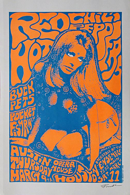
Taking the below poster for the Red Hot Chili Peppers 1986 tour as an example of typesetting that I find satisfying to view… My reasoning for this particular choice is that the type fits around the focal point, adding to the design as a whole. It goes somewhat against what Beatrice Warde’s argument suggests – that the text and information takes precedence over the design. In this case I feel that the two elements actually complement each other and a nice balance between design and information is struck. The psychedelic style of font allows for the form to be fairly fluid, thus all the information is present, and legible.
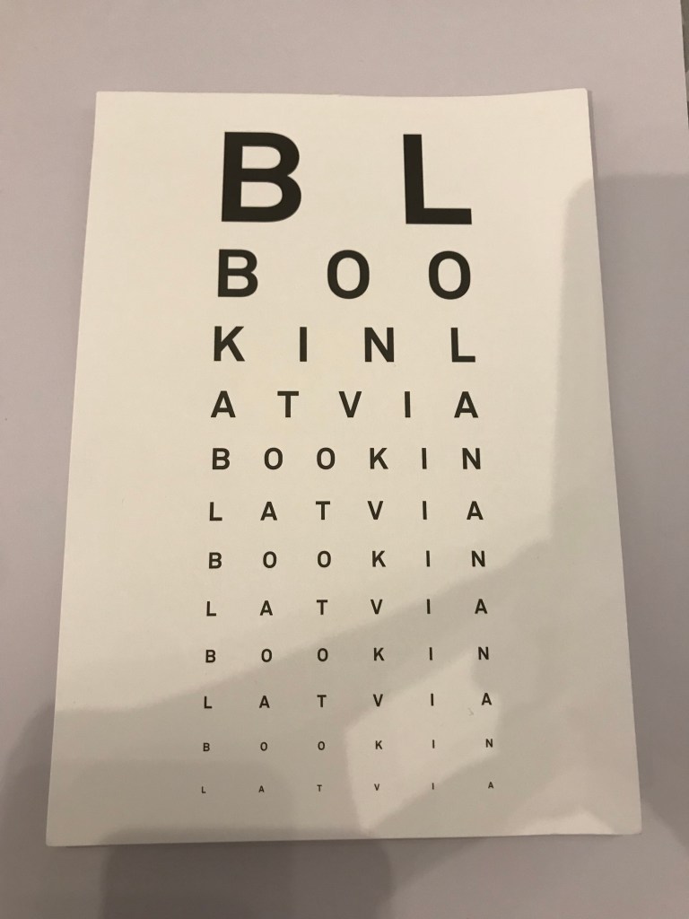
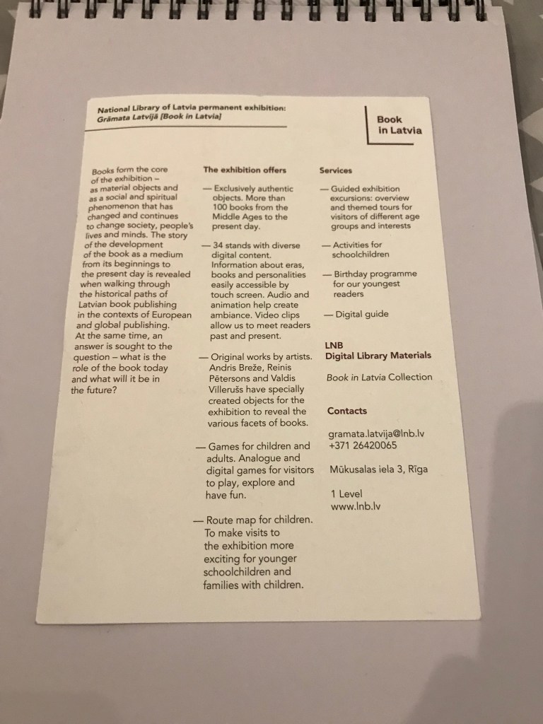
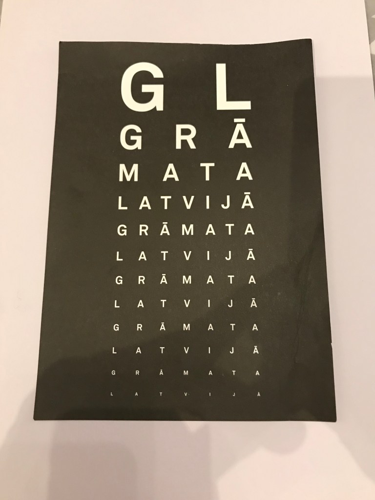
In stark contrast to the above, is an A5 two-sided leaflet I picked up on a recent trip to Riga in Latvia. The leaflet was advertising and contextualising a small exhibition being held in the National Library there. The front of the leaflet is what initially caught my eye. A very simple design, using an optician’s eye chart as inspiration, the exhibition entitled ‘Gramata Latvija’ (or ‘Book in Latvia’) is repeated on the front, getting smaller towards the base of the page. Not immediately easy to ascertain what is being portrayed, it enables the reader to delve further, which is when you turn overleaf and are greeted with a very clean three column layout in which the exhibition is explained in full. As stated I chose this piece, as I not only liked the style in which it was being presented, but also that it is in stark contrast to the poster above. Two very different examples of how type can work as the focal point or alternatively, with the focal point to good effect.