Tasked by a confectionary company to present some rough ideas for a new range of chocolate bars, this post will present my thought process and development on the way to producing some basic initial vector graphic logotypes. The three ideas which I had to develop were:
– Aztec Gold – Exotic dark chocolate with buried fragments of honeycomb
– High Tea Biscuits – An altogether classier chocolate biscuit
– Pow Milk Bar! – Retro chocolate for big kids
Below are my initial thoughts and sketches as documented in my sketchbook:
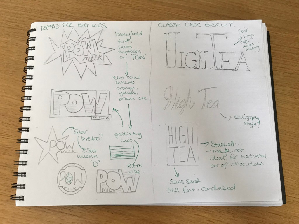
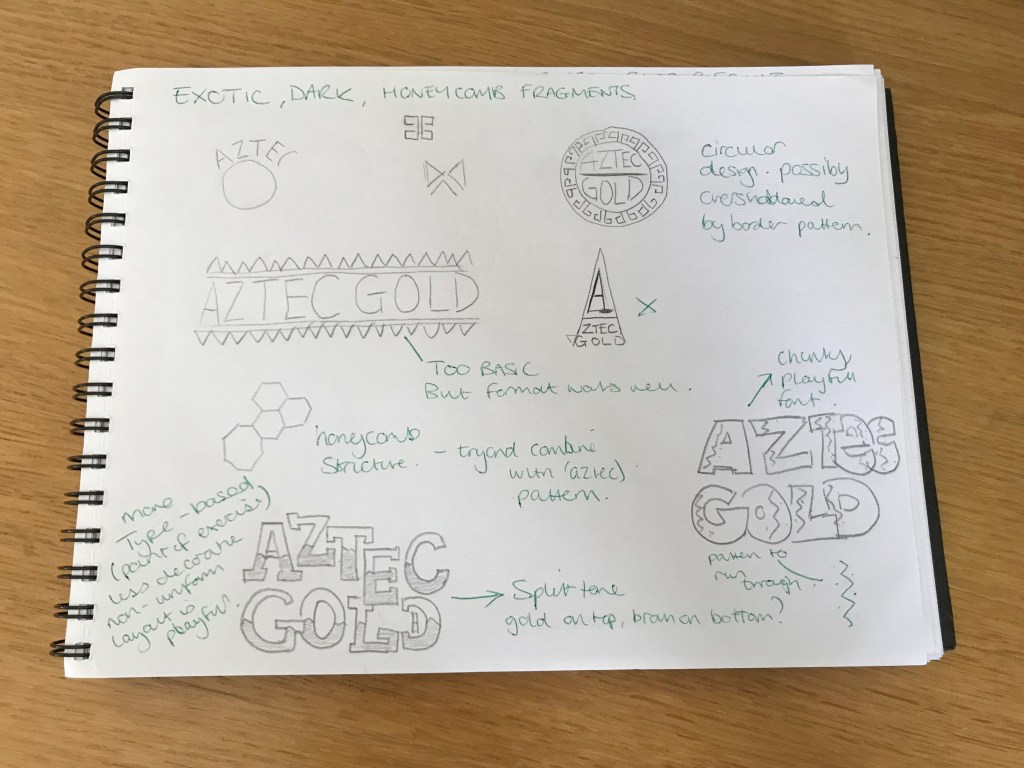
Using these pages and sketches as a start, I began to think which version would work best for each bar, and once a decision was made I developed them into vector logotypes as presented below:
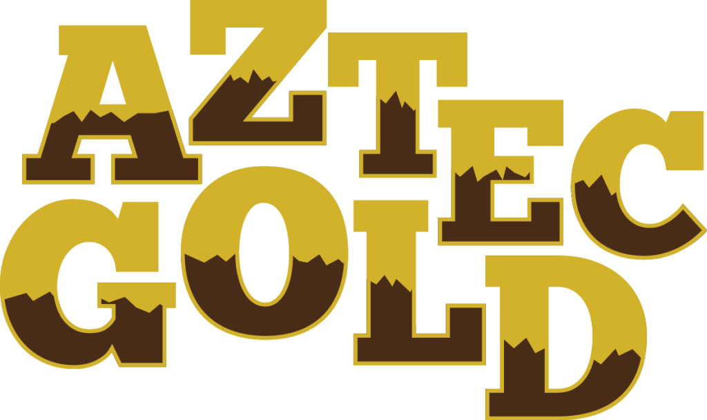
Aztec Gold: The thinking behind this was to have a playful dynamic to the wording, so having the letterforms on different levels, whilst maintaining a togetherness. The internal pattern reflects similar used in traditional Aztec designs, and also adds a hint to the dark chocolate nature of the product. And finally the heavy serif font also gives a nod in the direction of typical Aztec styled fonts in popular culture.
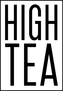
High Tea Biscuits: With ‘High Tea’ I took the literal sense of the word high, and made both versions demonstrate this in different ways. With the first, the ‘H’ and ‘T’ are tall, emphasising this. The serif font is also a subtle hint towards the classy nature of the product. In version 2, I opted for a tall, narrow sans serif font, as they can often be more favourable in the current design ethos in the world. A stacked logo, also adds another dimension of interest, and is a new take on traditional chocolate bar packaging, which is predominantly landscape in form.

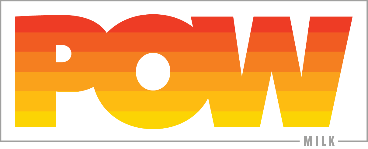
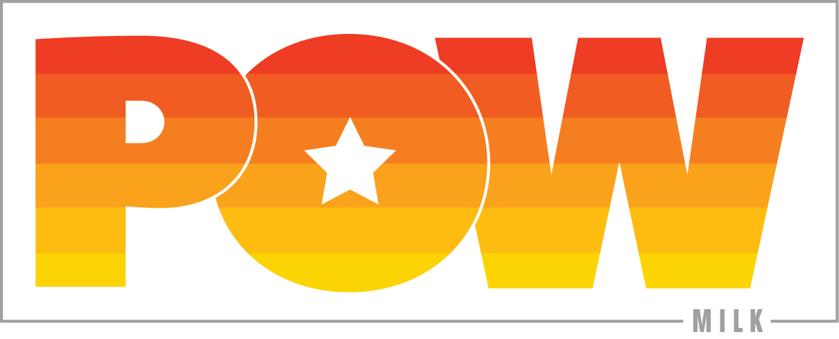
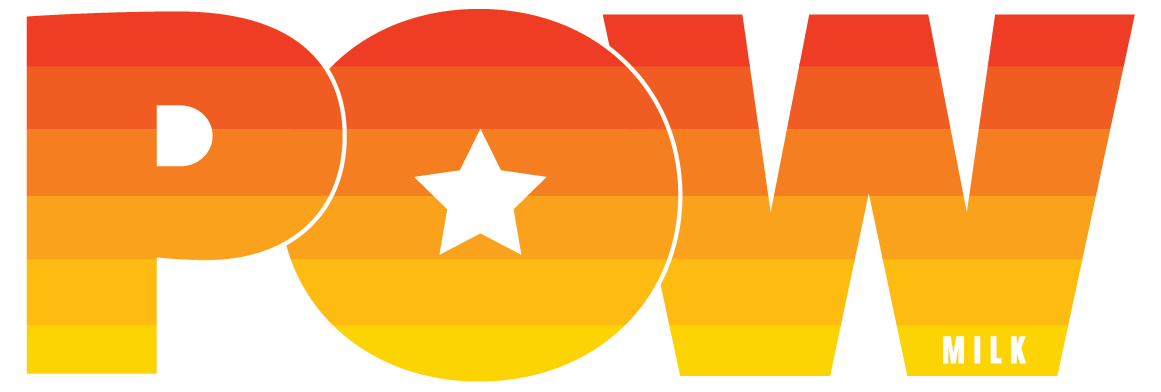
Pow Milk Bar!: A heavy, bold font here is used to give a sense of onomatopoeia to the word ‘POW’. The gradient colour scheme implies the retro stylistic nature of the chocolate bar, the orange/yellow scheme hints at popular colour schemes from the 70s/80s. Further to that, the addition of the star within the ‘O’, adds another layer to the design, giving it more depth. Potential to be displayed with or without a boxed border, depending on the usage or format in which the logo is being used.