For many corporations, their logo often defines the brand, and without it simply wouldn’t be recognisable. How then, does a company or corporation go about changing, or ‘modernising’ their logo and image? I have identified a couple of well-established organisations that have done just that:
Visa – Although not the most detailed or intricate logos to begin with, the Visa logo has undergone a few changes in the last few decades, eventually losing the ‘card’ emblem, and blue/yellow theme, in favour of a purely type-based logo, or logotype. The font has changed very little, but the yellow features have now gone entirely, which follows a trend that is in action worldwide.
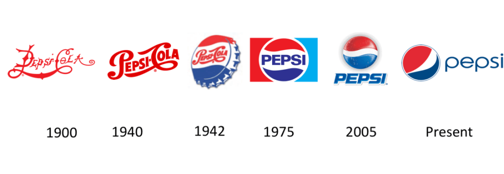
Pepsi – The Pepsi logo has undergone a number of pretty drastic changes in the last century. Starting with a cursive/script based logo which then made its way onto a ‘bottle cap’ motif in the mid-40s, where it slowly modernised to keep pace with the rapidly modernising world. The red and blue cap, with the white wave through the middle, became the company’s identity, and it something that has remained consistent since the 40s when it was introduced. In 1975 the cursive font was ditched in favour of a clean, bold sans serif font, instantly easier to read and recognise. This remained until 2005 when shadows and highlights were added to create a sense of depth and realism to the logo, the font also shifted to a modern (at the time) italicised, almost futuristic font. Again this remained in place until the present logo, where we see an entirely new take on the original ‘wave’ bottle cap feature, as well as another new font – this time all in lowercase (another notable trend of late). There is still a subtle nod to the original wave within the ‘e’ which is a nice touch and within keeping of the brand’s heritage. Another simplification occurs, and the shadows and highlights are lost, as well, everything is flattened in order to become more user friendly.
Volkswagen – The German car manufacturer Volkswagen has undergone a number of logo tweaks through the years, however the main feature ‘VW’ motif has remained throughout. Unlike the other brands mentioned though, with the latest instance VW have looked to their past for inspiration. Moving on from the depth, shadows and gradation of colour, to a very simplistic and flat roundel which VW say is to take the company into the new electric era. The motif remains the same, but for the first time, we see a reduction in the weight of stroke used, perhaps making this the most dramatic shift in recent times.
As we can see, the general trend with all three logos, is the gradual simplification that occurs, especially once we enter the current phase of each logo. I believe this flattening and simplifying is to cater for, and assist use within a broader usage. Whereas logos in the past were generally printed only, nowadays they appear on a wide spectrum of ephemera – from printed, to digital, and huge scale right down to very small. The logos now have to work in all spaces they are required, and the easiest way to achieve this is by simplifying forms, and limiting colour palettes. This is a trend that is happening on a global scale, very rarely now do we see logos with such intricacies as we did in the past.
