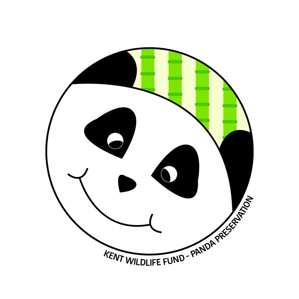
I was asked by a local wildlife park to develop a logo that supports the idea of a popular and fun family-centred experience, but that also helps to make people more aware of the conservation work they do. I chose an animal that is both endangered and hugely popular with a family audience – the Panda. Below is my initial sketchbook thoughts and sketches on the subject:
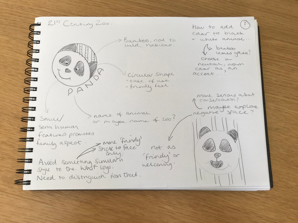
In order to distinguish my logo from existing panda-based logos, I decided to concentrate purely on the animal’s face. This is in contrast to the logo used by the WWF (World Wildlife Fund).
I had one idea to utilise the black and white colour scheme of the animal, and do a logo using negative space, however after sketching that out, decided it wouldn’t be friendly enough for the task at hand.
So I subsequently decided to include facial features, including a smile, which gives the panda a semi-human quality, and makes it have a much more ‘friendly’ feel to it. To fill the dead space between the ears, whilst retaining a circular shape, I decided to give a hint towards the animal’s natural habitat and food source – bamboo. It also enables me to add a splash of colour to an otherwise, monochrome logo.
And finally, to really describe what the logo represents, some text following the circular shape, is added to the bottom right of the logo – thus identifying the animal and the wildlife park/scheme.