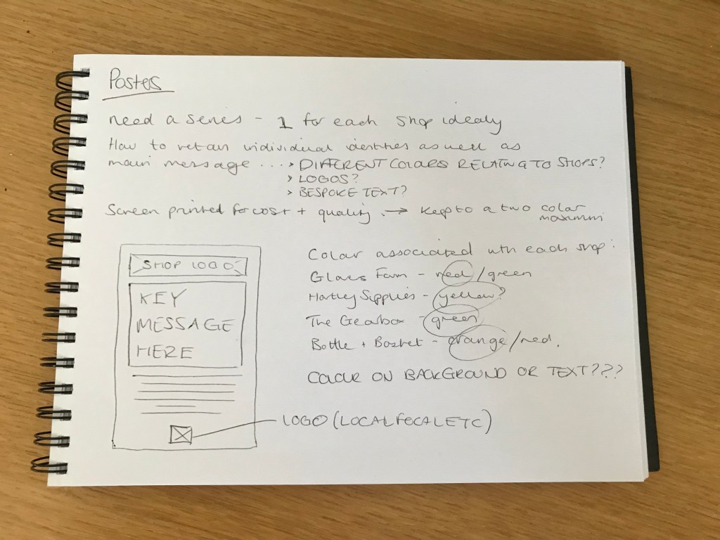
The final project for assignment 3 – to develop visual material for a campaign to get local people to shop within their community. Choosing my own village Hartley as a real world example, I identified 4 shops which would really benefit from a larger local customer-base: Glovers Farm (fresh meat and veg farm), Hartley Supplies (DIY shop), The Gearbox (local car parts store), and Bottle & Basket (alcoholic and non-alcoholic beverages). Together they cover a broad amount of the market, meaning that people can get the majority of their ‘needs’ all in the one village – in which everywhere is walkable.
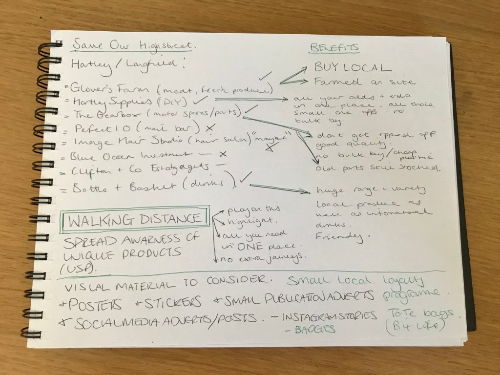
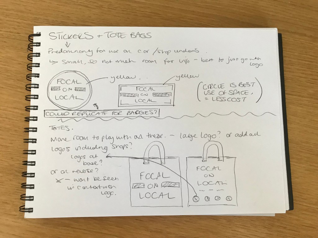
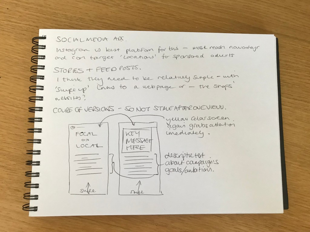
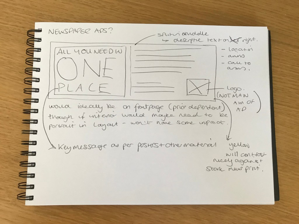
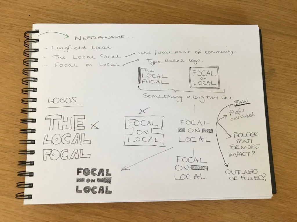
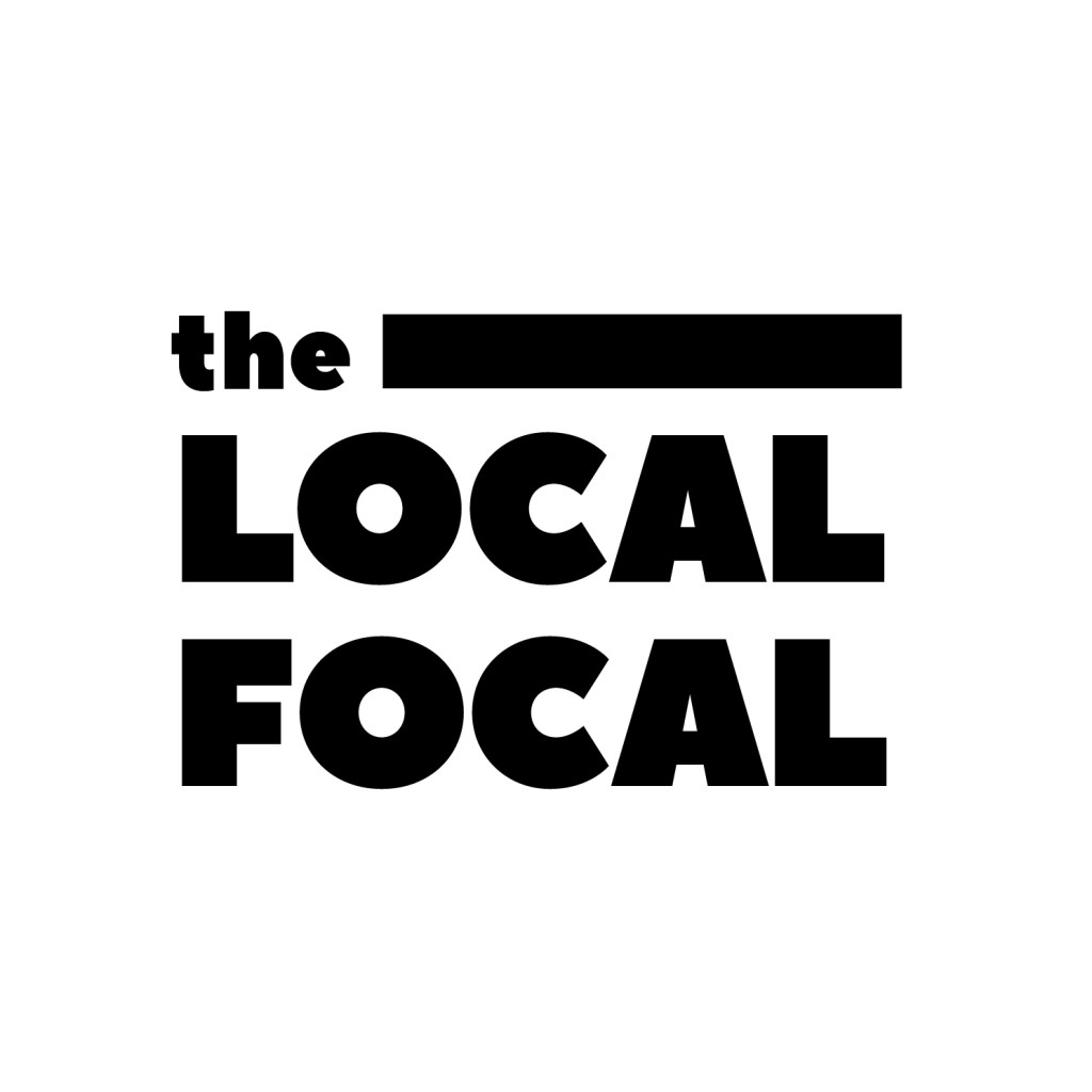
After I had identified the shops and the key messages behind why people should choose them over driving to an out-of-town superstore, I then began to think about what sort of visual material would be suitable for the campaign. It all needed to be relatively inexpensive, yet effective in drawing in both young and old. As you can see in the scans of my sketchbook above, I came up with a fair amount of different material, both printed and digital. The first step however, was to come up with an ‘umbrella visual identity’ for the campaign. I came up with a couple of options, but my favourite, and the one I think portrays the message a clever, yet easy to understand was ‘Focal on Local’. It encourages a focus on the local community. I then I had to design a logo/identity, wanting it to stand out within a village environment I decided it needed to be quite bold and eye-catching, thus using a heavy font and bright colour scheme to really stand out and perhaps contrast against the quiet, reserved nature of village life.


After deciding on the visual direction that the campaign would head in, it was time to make a start on the rough designs for each of the aforementioned pieces. The whole process is documented in the ‘Campaign Presentation Document’ attached in my submission.