‘Using either your own family history or a fictitious one, create a family tree using a pedigree or genealogy chart. Now use this family lineage to create a cartogram that plots where these family members were located. Look at some examples online if you’re not familiar with any of these ways of presenting information.’
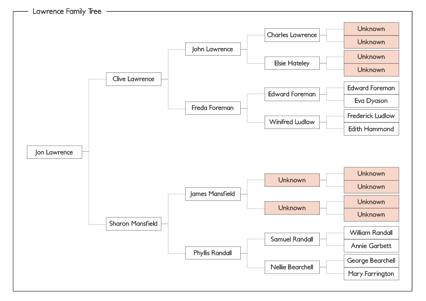
The obvious place to begin with this task was to plot out my family tree. Luckily I had only relatively recently researched my own family tree, so the information was already to hand – a significant head start!

I then converted this tree to a nice, easy to follow digital format, as seen below:
We were asked to create a cartogram to display the location of each family member. However before this task I had no idea what a cartogram was! (a map on which statistical information is shown in diagrammatic form.) So I decided to research a few examples and see which style suited what I wanted to achieve, the most.
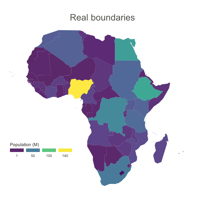
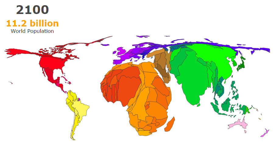
After viewing a few examples including the above, I settled on a simplified version of what I understood a cartogram to be. Using overlaid circles of differing sizes to highlight the locations of the family members, and also the number of members in certain areas.
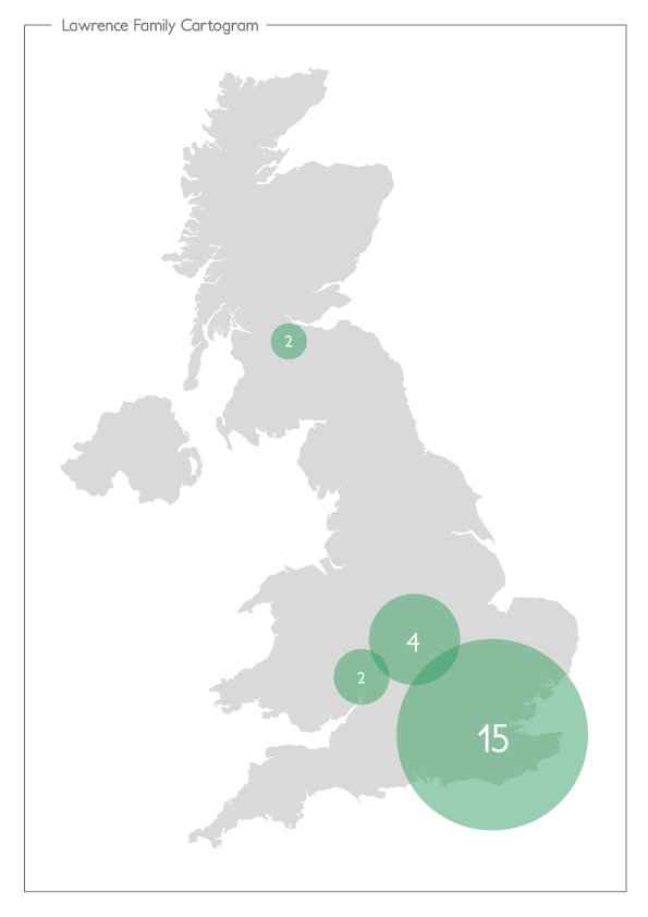
As you can see, a very simple version, but I think it displays the key information in an easy to digest way. I feel it could have been more interesting, but most of my family have all originated from the London/South East area, meaning that there wasn’t too much diversity in the cartogram itself.
Links:
https://www.data-to-viz.com/graph/cartogram.html
http://metrocosm.com/how-to-make-cartograms-with-animation/
