‘A research publication is running an article on our changing relationship to cooking in the home and what we consider essential ingredients. Researchers took a snapshot of what people had in their fridges and compared it to what people thought they would make with these ingredients. They were interested in looking at the kinds of foodstuffs we cook with, our reliance on pre-prepared food, and whether our attitudes to cooking are changing.
Using your own fridge’s content as a starting point, create a graphic representation that shows the relationship between the various ingredients. For example you’ll probably use milk for making tea or coffee. You might use butter, mustard and cheese for making sandwiches. And you’ll need all of these ingredients if you make a cheese sauce. How can you use Venn or Euler diagrams and/or the Isotype system to plot this graphically?
Don’t forget that this is a graphic design task not a maths exam, so be playful and visual in your approach.
You may want to do your own research into these three important representational systems before you start work on this exercise. Make notes in your learning log.’
So I actually found this task incredibly frustrating/difficult – I don’t have a mathematically minded brain, so trying to get my head around these graphs was a tough task! Nevertheless I had a go.
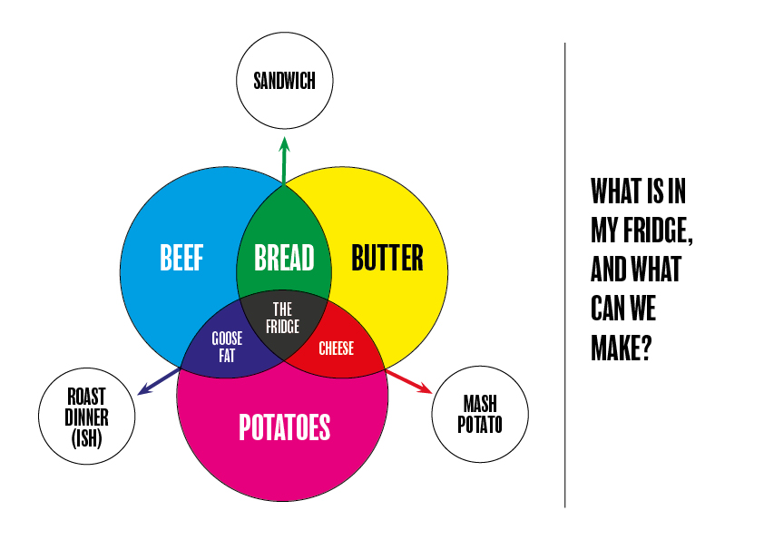
First off I made a list of the more essential ingredients in our fridge, and then tried to work out what I could make, using the majority of them…
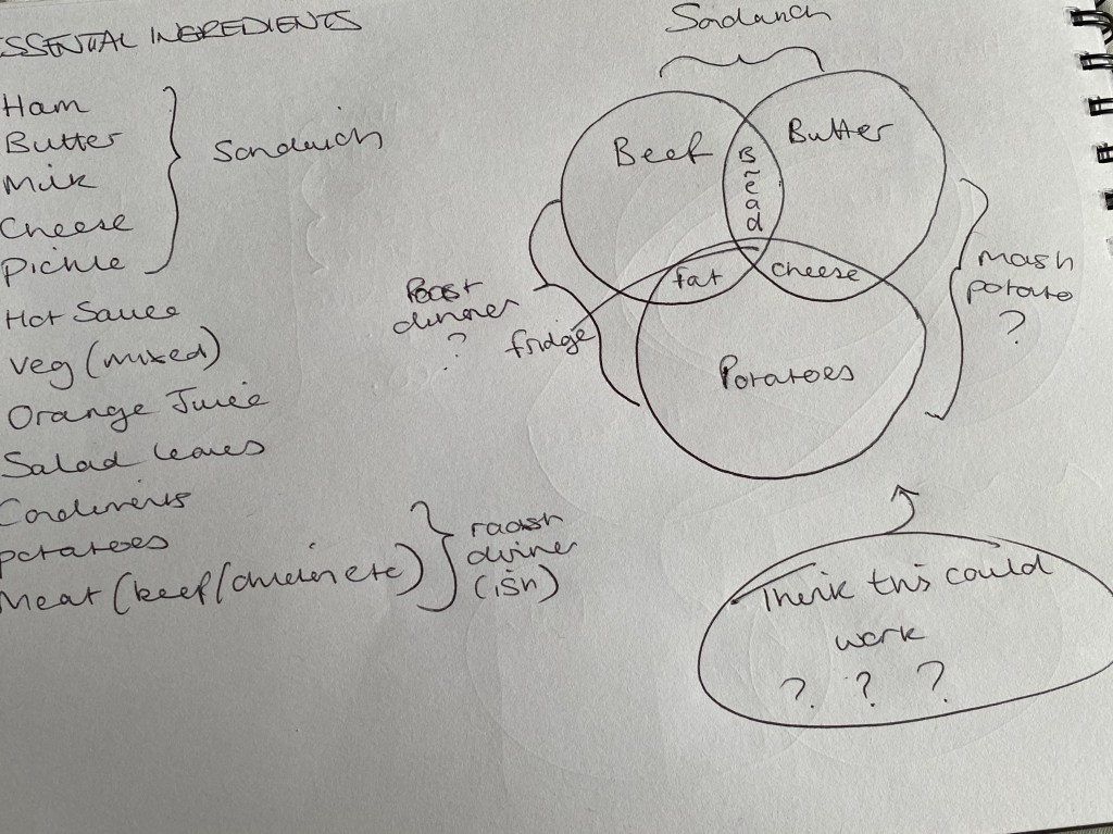
The rough drawing in the top right was about the closest I came to anything that resembled a successful Venn/Euler diagram (research below)
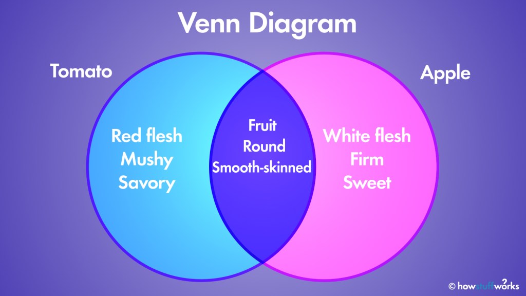
The Venn Diagram is perhaps the one graph out of the three we were asked to research, that I had a vague idea about… The overlapping circles really being the standout/obvious choice for this task in my eyes.
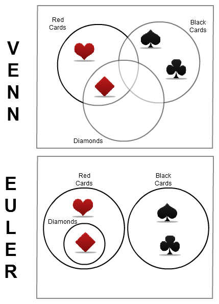
So this was probably the most helpful image I could find, that could assist me in understanding the main difference between Euler and Venn diagrams. They are very similar, but this shows, visually the key difference.
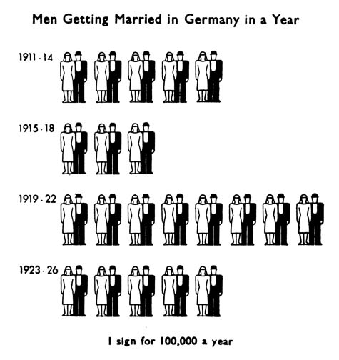
The third type of graph/diagram we were asked to explore was an isotype diagram… After looking up what one was, it seemed pretty straightforward – using icons/imagery to denote a certain amount or volume of an object(s). However, I really struggled to see how on earth this could be helpful for the ‘what’s in my fridge’ equation here… It doesn’t appear to pull together any relationships between the ingredients.
With all that being said, I decided to stick to what I knew, and go with a Venn diagram to display my results:
Links:
https://science.howstuffworks.com/math-concepts/venn-diagram.htm
https://www.researchgate.net/figure/Euler-and-Venn-diagrams-produced-by-VennDiagramWeb-each-depicting-three-sets-x1-7-8_fig2_309067742
http://isotyperevisited.org/2012/08/introduction.html
