‘Think about how you could represent your typical working week. You may want to categorise your time by what you’re doing (e.g. paid work, OCA work), where you are (at your place of work, at your desk at home) or another method. Try and represent your time proportionally. Develop your ideas through at least three different ways of representing the data. Reflect on how these different representations look. Are some more visually interesting than others. Are some more accurate? How could you improve your designs to make the information more interesting and engaging for an audience, while maintaining the basic proportion of the information?’
I started off by jotting down/working out a percentage of my time, per week, that I spend on things. This was a little strange/difficult at first because my working week (and pretty much everyone else’s in the country) at the moment is drastically different to normal – due to the ongoing COVID-19 crisis and many people off work or working from home. With this in mind, I could only work out a rough guesstimate of the amount of time I spend (in normal times) on certain tasks.
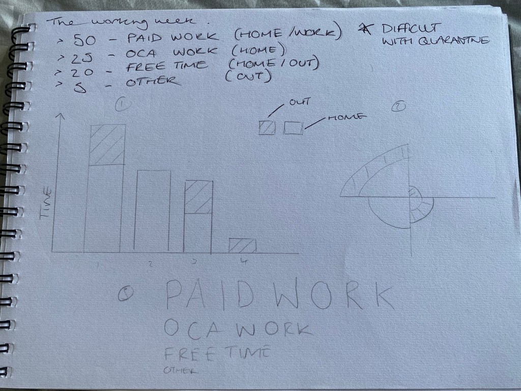
Once I had done this, I tried out a a few graphical ways to represent this data, firstly using the traditional (but apparently most effective) bar chart, and then two more of my own creations. Deciding that actually, all three were decent options, I subsequently turned all three into digital versions.
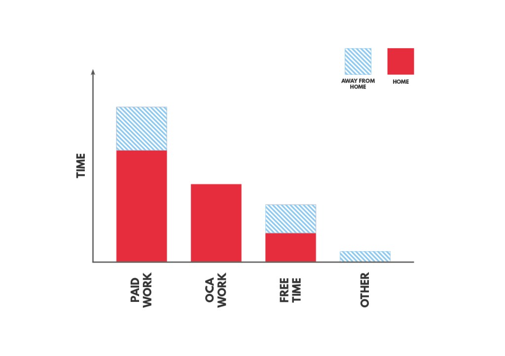
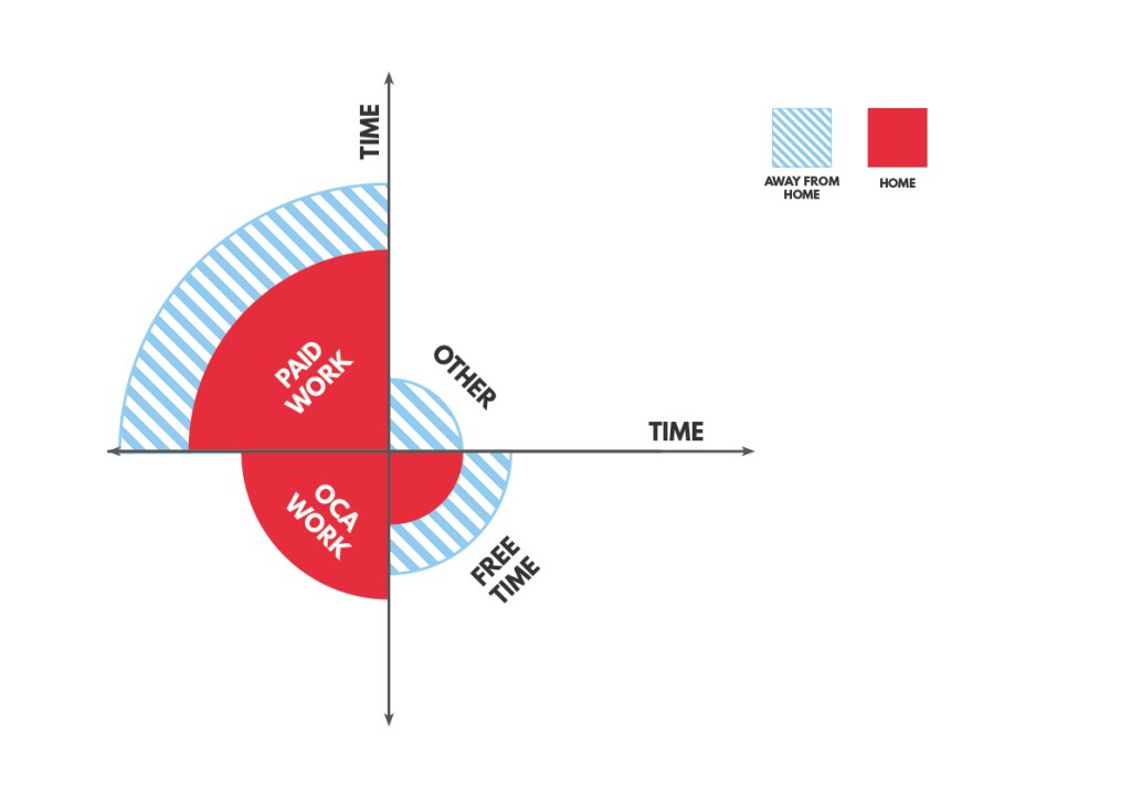
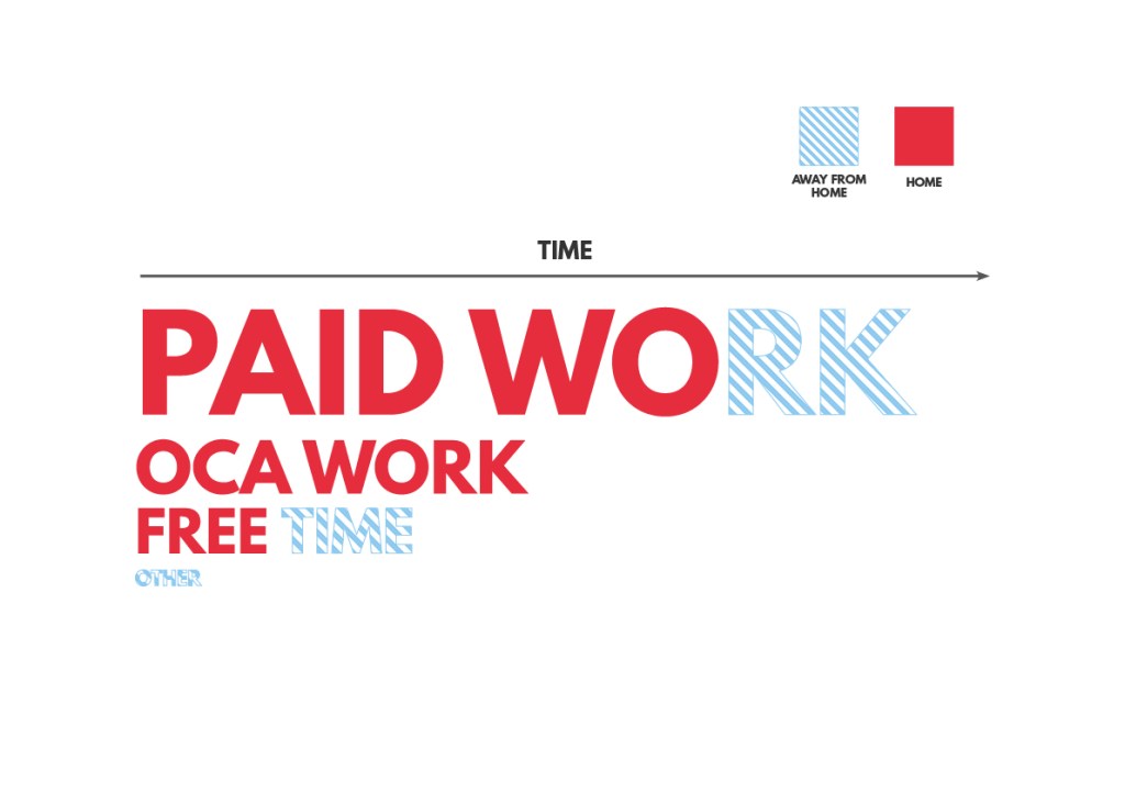
Super pleased with the outcome of all three, I think not only do they look visually appealing, they also demonstrate the data clearly – which is emphasised by the colour scheme I chose to use.
