The aircraft safety card as a piece of informative design, is perhaps one of the most universally used, yet also one of the most varied in how it gets its information across.
In terms of different aircraft, they don’t vary hugely, however between airlines, the design can look fairly different. Some choose to use numbers to direct the readers’ eyes around in the order they wish, while some use suggestive arrows to do the same job. You could argue that using arrows is perhaps the more obvious way to do it, and in the case of safety this is arguably the best practise. But from a design sense, do they arrows take away from the aesthetic…?
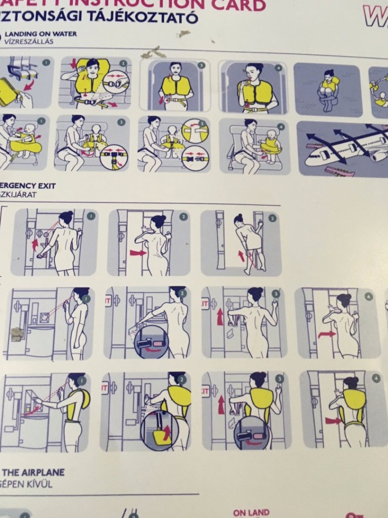
Using this Wizz Air example, we can see a muted colour palette, which as a result serves to highlight the most important points of the card. They have chosen to use numbers as a guide, though I feel they would need to be a bit larger to have the desired focus.
In contrast, this RyanAir card uses arrows heavily to illustrate which direction to do things in, and what goes where etc. A bolder colour palette means that the arrows stand out much more clearly than they do on the previous Wizz Air example. Sub headings also make the different sections clearly defined, leaving no room for ambiguity.
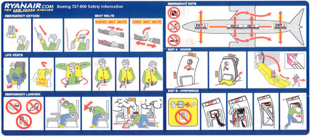
In my opinion this is the better of the two as it is far clearer to see what is happening in each section and which order to do things. The landscape (folded) nature also means more detail can be added.
