‘A manufacturer of household appliances wants you to develop a new instruction guide for one of their products that describes its various components and their functions as well as providing basic instructions on use. For example, if you choose to produce instructions for a vacuum cleaner, you’ll need to represent the parts of the machine as well as explaining how to empty it or recoil the lead. Identify any safety elements you need to include in your diagram and use standard visual formats to portray them.
Think about how your user will know what each component is, how you describe any movements within the instructions, and the role typography plays within your instructions. It doesn’t matter if you’re not a confident illustrator; this task isn’t about drawing accurately, but about how you choose to present information. Illustration is just one option; you might want to use photography or explore alternative ways of communicating your instructions.’
In comparison to the previous task, I found this one to be much more enjoyable and better suited to how I work. My household object of choice was the humble kettle – used everyday, but they can vary a fair bit in how they are used.
After the previous research into aircraft safety cards, I was inspired to display my answer to this task in a similar way. This involved using a basic grid system for layout, and numbering to help identify which order to complete the steps in.
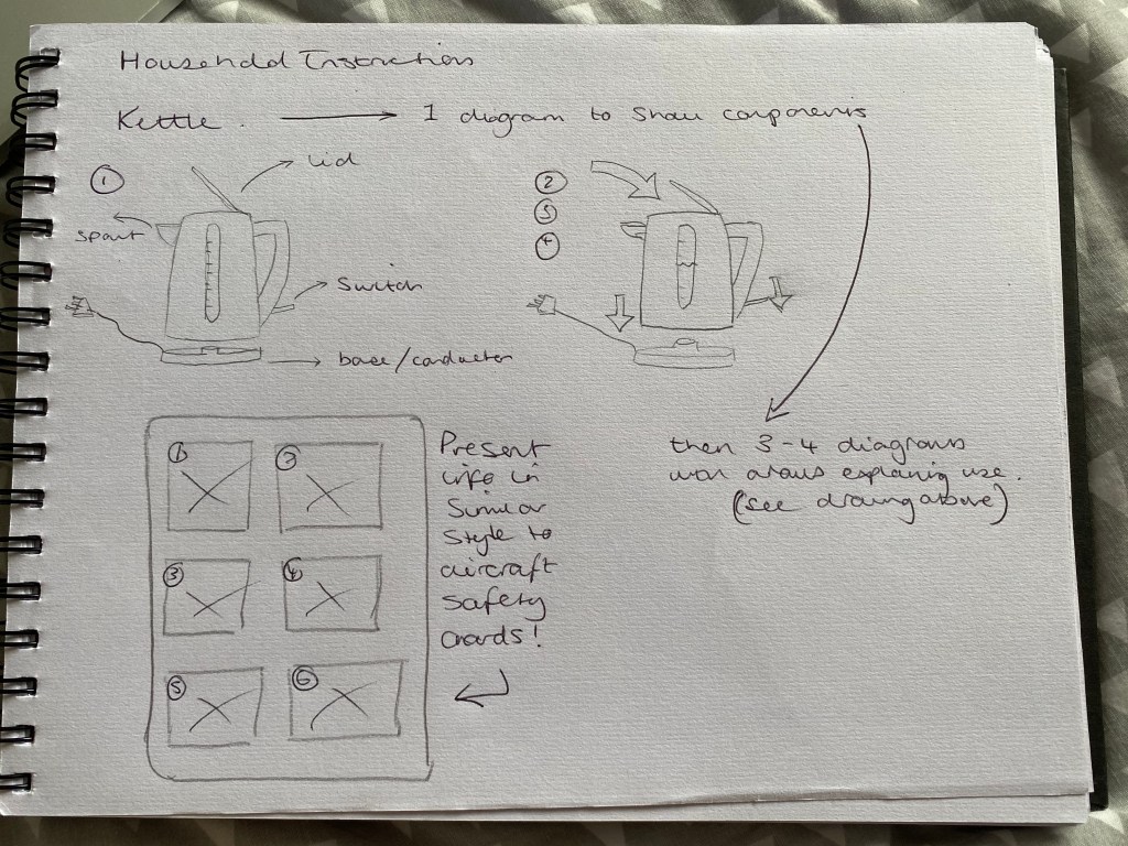
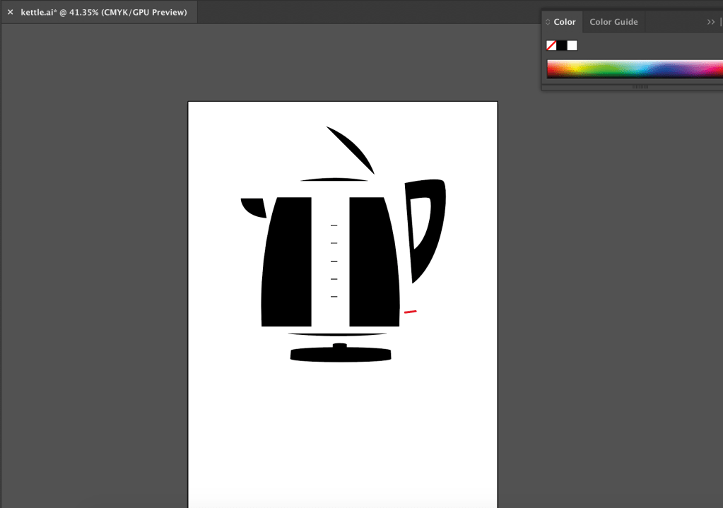
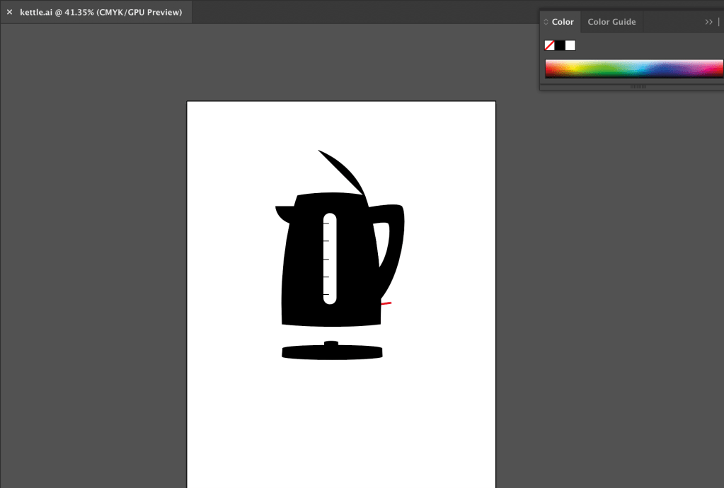
The first step was then to draw my kettle (as seen in the sketch above) on Adobe Illustrator. However, I needed to do this in such a way, that all of the individual components were separate, in order for me to easily demonstrate each section on my instruction card.
Once I was happy with the kettle illustration, I moved onto the card layout. I already had the idea in my head, so it was a relatively easy task to relay that to inDesign.
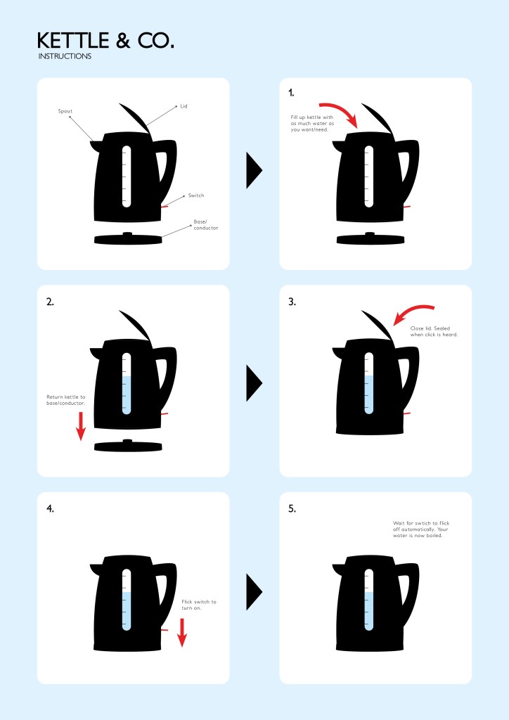
Again, I was very pleased with the final outcome for this task. I think I achieved everything I wanted to in terms of creating a clear set of instructions in an ‘aircraft safety card’ style. I also think the addition of the arrows and concise text work very effectively together.
