‘Given the global dimension of much of our food production and processing, food miles have become a way of assessing the environmental impact of our eating habits. A campaigning organisation wants to draw attention to food miles and the excessive distances the ingredients of a fruit salad on offer in a UK supermarket have travelled. They ask you to develop a linear diagram that plots each of its ingredients from farm to transport depot to processing factory to supermarket. For this campaigning tool you’ll need to think about how to prioritise the information to show distances travelled as well as the diversity of locations and stops along the way.
Distances are as the crow flies and have been calculated using Organic Linker’s Food Miles calculator: http://www.organiclinker.com/food-miles.cfm
Your fruit salad contains:
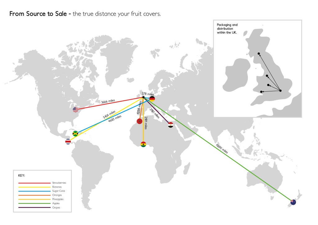
1 Bananas from Costa Rica – 5,424 miles (8727km)
2 Strawberries from US – 3,666 miles (5898km)
3 Grapes from Egypt – 2,181 miles (3510km)
4 Apples from New Zealand – 11,690 miles (18809km)
5 Oranges from Morocco – 1,254 miles (2018km)
6 Pineapples from Ghana – 3,176 miles (5110km)
7 Sugar cane picked in Jamaica and sent to Germany for processing – 4,683 miles (7535km) – before going to London 578 miles (929km).
The salad was made and packaged in a factory outside London before being driven to depots in Manchester, Cardiff, Birmingham and Glasgow, and from there to shops all over the country.
Create a design that either deals with a specific ingredient or provides an overview of where all the elements come from. As a campaigning tool, your designs need to be eye-catching as well as presenting key information. The client wants people to be shocked by the vast distance this food has travelled but doesn’t want to be accused of making false claims – so stick to the facts.’
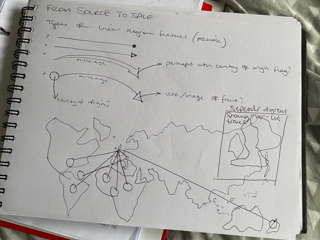
I work with maps on a fairly regular basis in my day job, so the though of a map based task was not a particularly daunting one. The idea of producing an infographic style map for a very important issue had me itching to get started. The first step, in my eyes, was to decide on how I would present the information. To me the best way to do so was to use a ‘world map’ as opposed to one that localised the info to just the UK. This way I felt would have more impact on the viewer, as to just how far their food travels.

I wanted to use a type of linear graphic that would mimic the journey taken by the corresponding food. I initially explored the different ‘arrow heads’ or points that I could use. My first instinct was to use arrows to show the direction of travel, but soon realised that the arrow heads would become very messy and confusing when all converging on the same destination. So I opted with a simple point-to-point linear feature. I would then do a zoomed in section on the UK to show the foods’ onward journeys after landing on our shores.

Above is the final outcome – I had initially thought of using some icons to demonstrate the individual fruit, but decided that as this was a serious topic, a more serious/professional approach was required. This led me to using a simple colour-coded key system, and the origin country’s flags to show the exact locations. I think you can get a good sense of just how far the fruit has travelled to reach our shops, and it seems shocking!!