‘Developing effective signage requires a number of things: understanding what information is required, finding a suitable way of displaying it, and finding the best place to locate it. With this in mind, think about how you’d create a series of signs to direct tourists from a local landmark to cafés in the area and to transport networks such as the nearest bus stop or train station. Use your own location or experience of being a tourist to site this exercise. What information do you need to put on your signs? How many different signs do you need and where will you put them? Think about tourists wanting to go to the landmark as well as needing to know how to get back again.’
Signage, in particular directional signage is something I’m very familiar with, dealing with it on pretty much a weekly basis at work. So I felt in a good position when it came to attempting this task.
Now one of the most important aspects of directional signage is that it needs to be readable from either a distance, or in a crowd. This means either the signs end up quite large, or more commonly are on a totem-style pole which enables them to be seen when in a crowd. Also it is very important, as the brief alluded to, that tourists are able to retrace their steps to get back to somewhere, this usually means that the signs are double sided – so what they show on one side, is reflected on the reverse.
Colour scheme is also important, it can determine what parts of the sign belong to a certain area for example. Or simply, it just helps them to be legible.
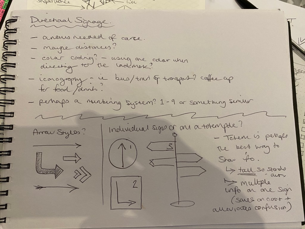
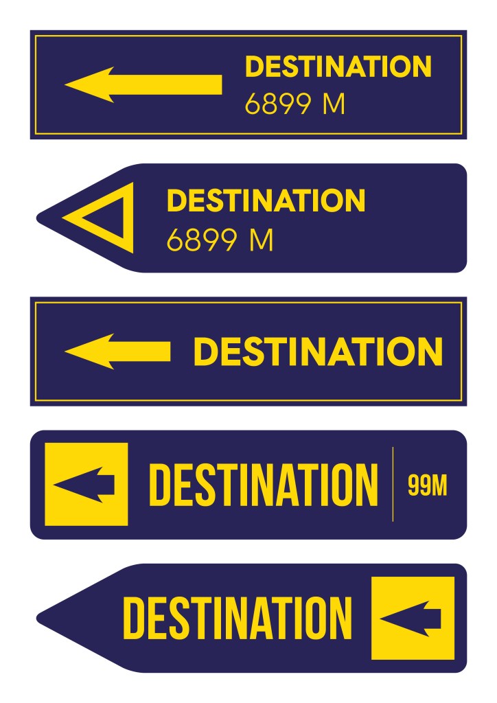
So I decided to go with the totem pole idea as I believe it to be the most effective, above are some options I came up with for the sign part of the pole. Settled on a yellow over blue colour scheme as it really highlights the important aspects of the signs, whilst being more aesthetically pleasing than a basic black/white combo.
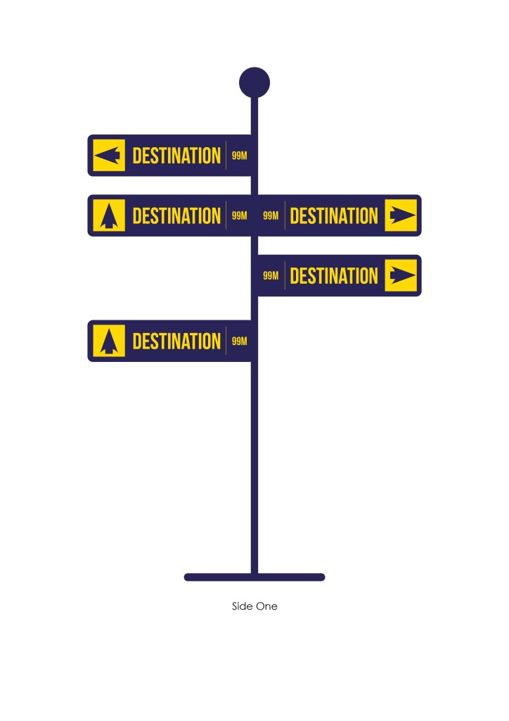
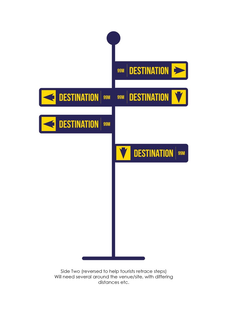
The bold arrows are clear in their direction, and the use of a condensed font means that the point size can be larger, and more info fitted onto each sign – both contributing to making the overall sign a clear focal point around a venue. In terms of numbers of signs – you don’t want so many as to overwhelm and confuse potential visitors, but not too few that they are able to get lost. But putting a number on a fictional venue without knowing its size is a difficult task.
