‘The signage of previous eras remains with us in the form of street names, plaques, older shop fronts or other signs that have never been removed. Streets and public buildings are therefore a potential source of typographic archaeology in which we can discover forgotten or obsolete forms of signage, identify a wider history of typographic styles, and pick out different forms of signage from hand-rendered, metal cast type to amateur hand-written signs. Different places have different traditions or vernaculars of typography and signage, which gives each place a sense of its unique identity. However this wealth of public signage also creates problems as signs compete for attention, take up space within our field of vision or interact with one another in unexpected juxtapositions.
Graphic designer Phil Baines developed his Public Lettering project in 1997 to document some of the typography he encountered on a walk in central London. Much of this typography is from public signage, while other examples are drawn from things like manhole covers and dates on buildings. See http://www.publiclettering.org.uk/
Following Phil Baines’ idea of taking a typographic journey, use drawing and/ or photography to document the forms of public typography, lettering and signage you encounter on a chosen walk. Reflect on what you find and compile your images in a poster, small booklet or other format than shows the chronology of your walk. Develop some narrative around your images. For example, identify and reflect on examples of good and bad signage from an information perspective, examples that you found interesting as a designer, and others than might reference the history of typography in some way.’
So here are the photos from my walk… I live in a pretty sleepy little village, so there’s not exactly an abundance of interesting things, but I found what I could!
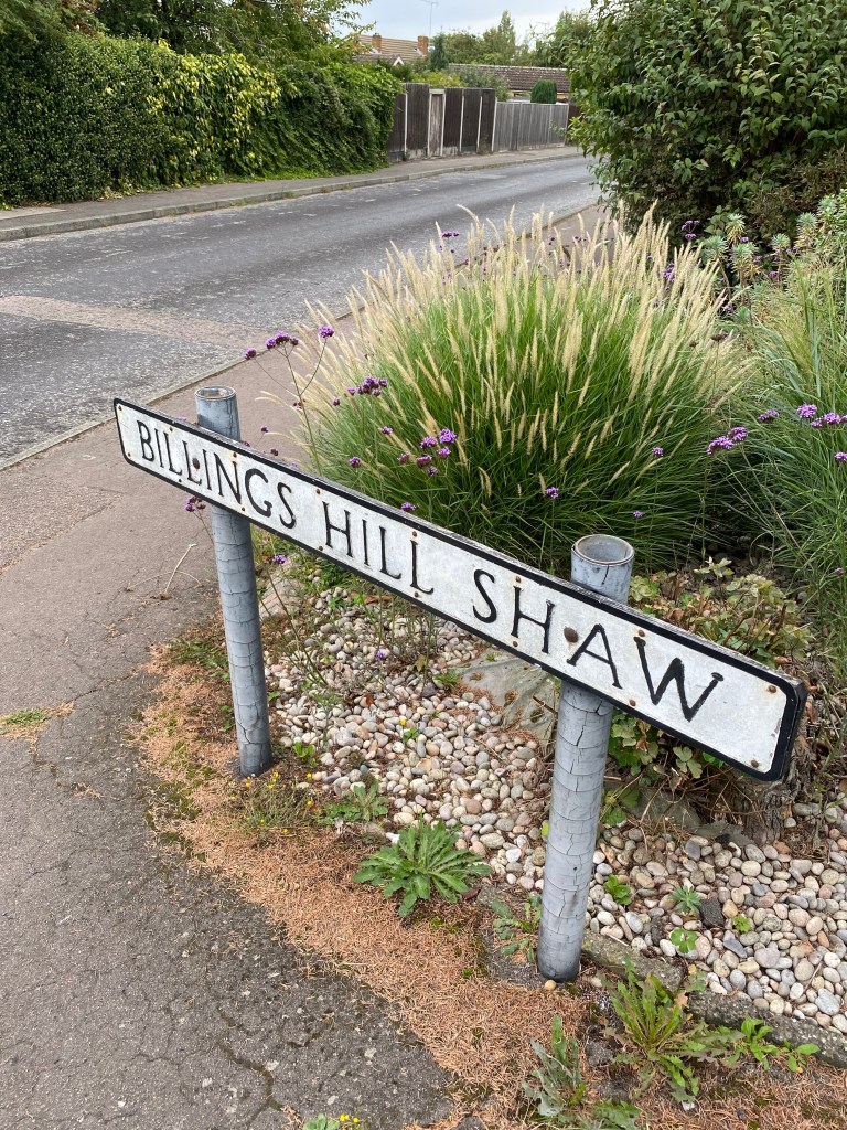
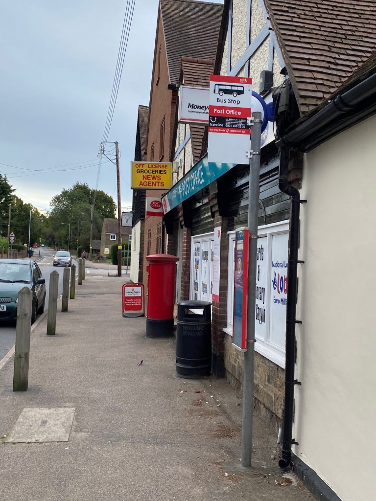
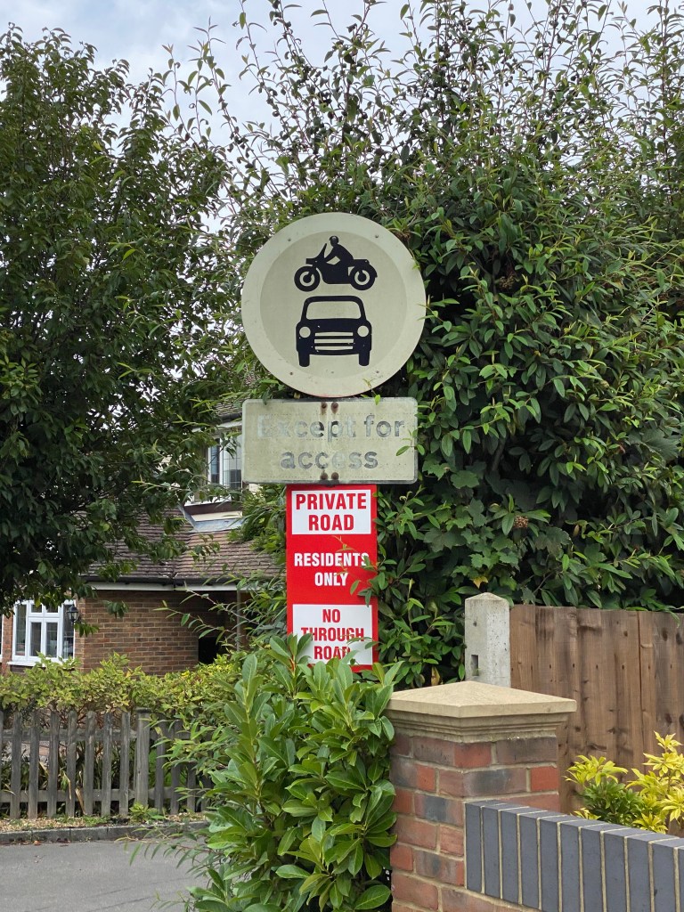
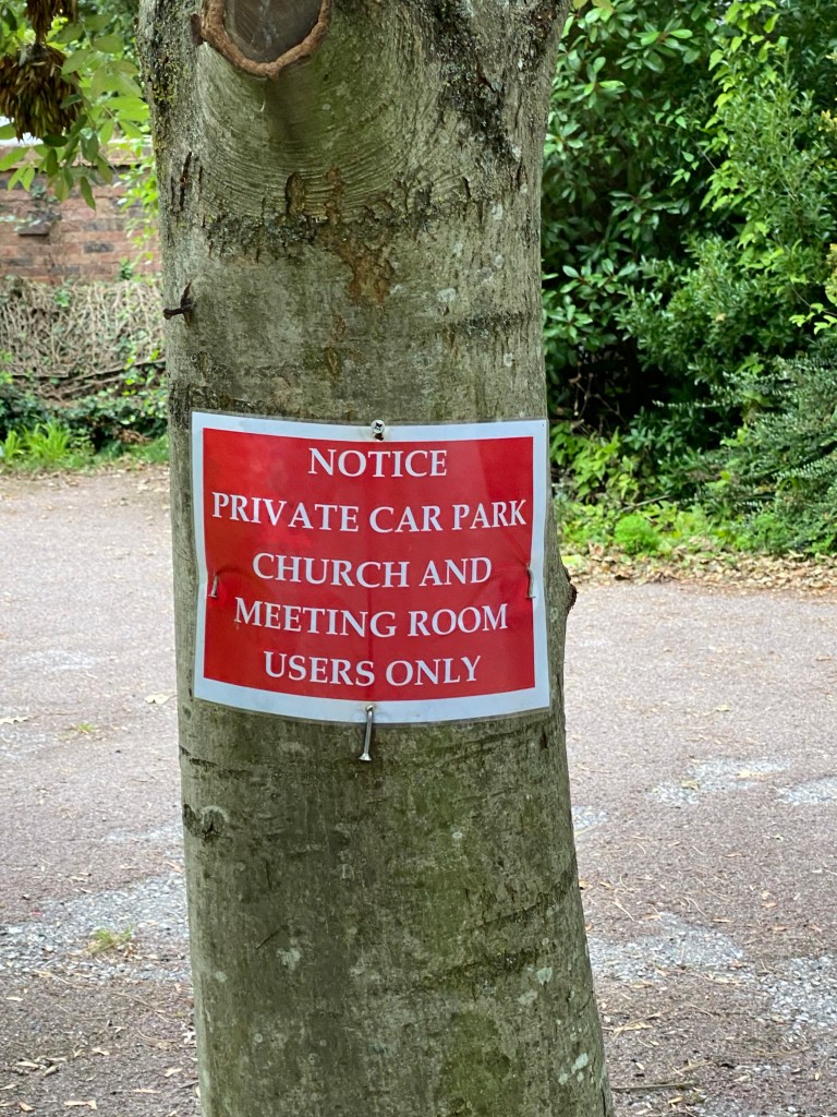
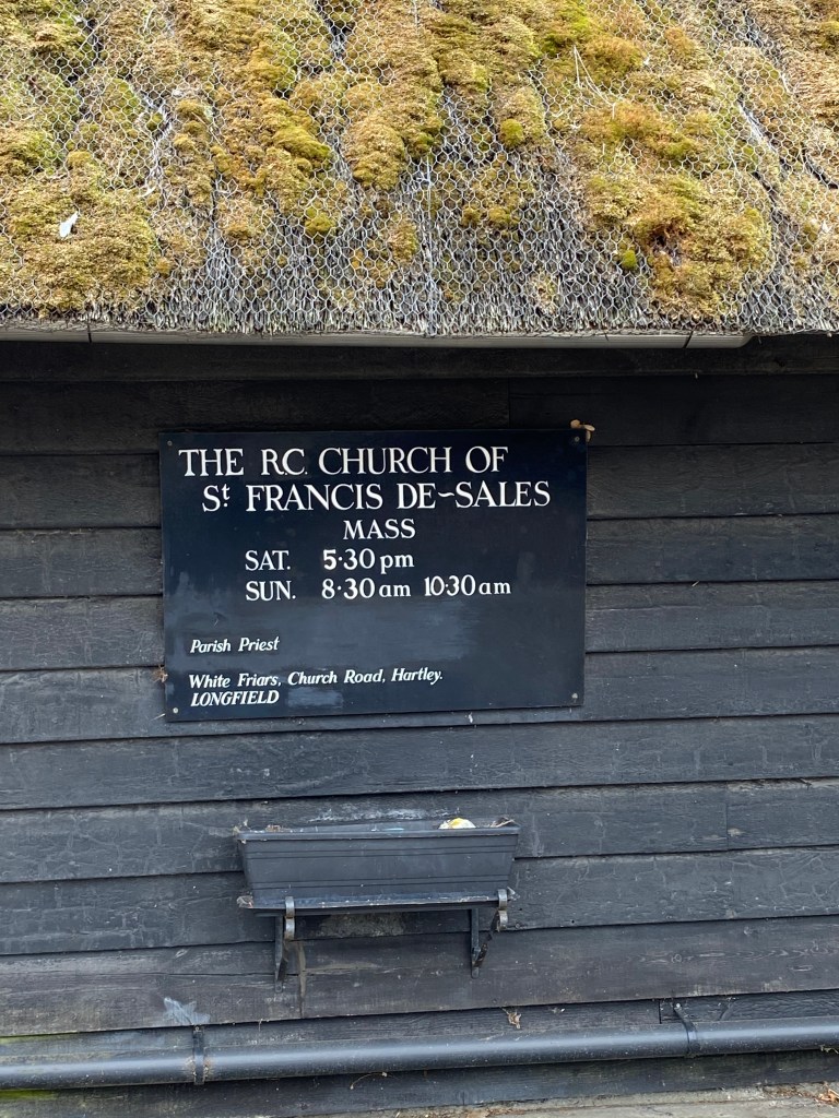
Image 5 – I found this particularly interesting due to the contrast of new and old. You can see that the original sign has completely faded losing all of its’ colour. The residents, have then had their own sign made to compensate for this.
Image 7 – The old church. Perhaps the signage with the most history and intrigue about it… I tried to look up how old the building is, but to no avail. However I did find out that it is grade II listed. The lettering on the sign itself is actually hand painted. The black backing is in keeping with the black of the wood, and the listed nature of the building.
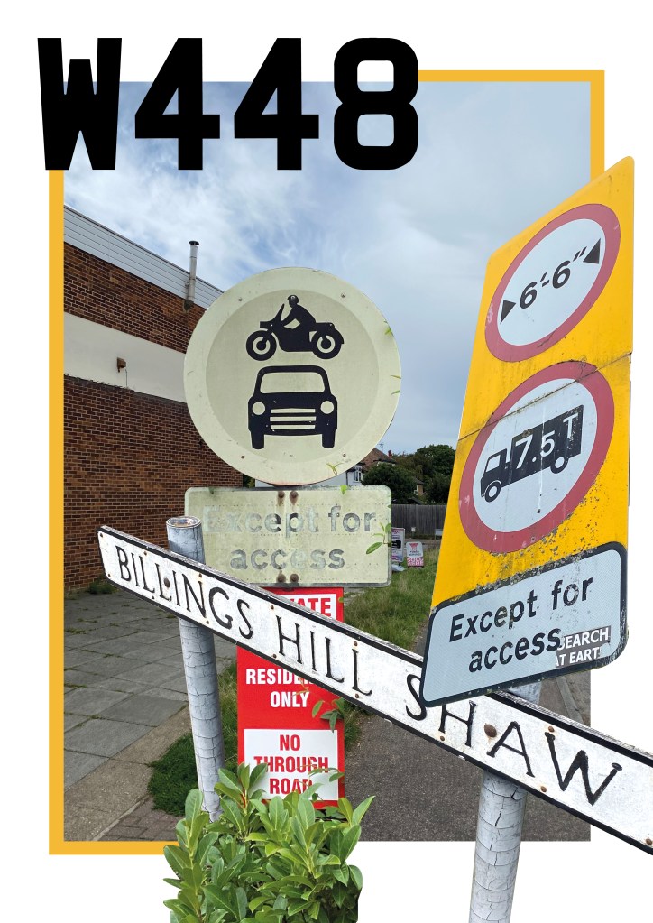
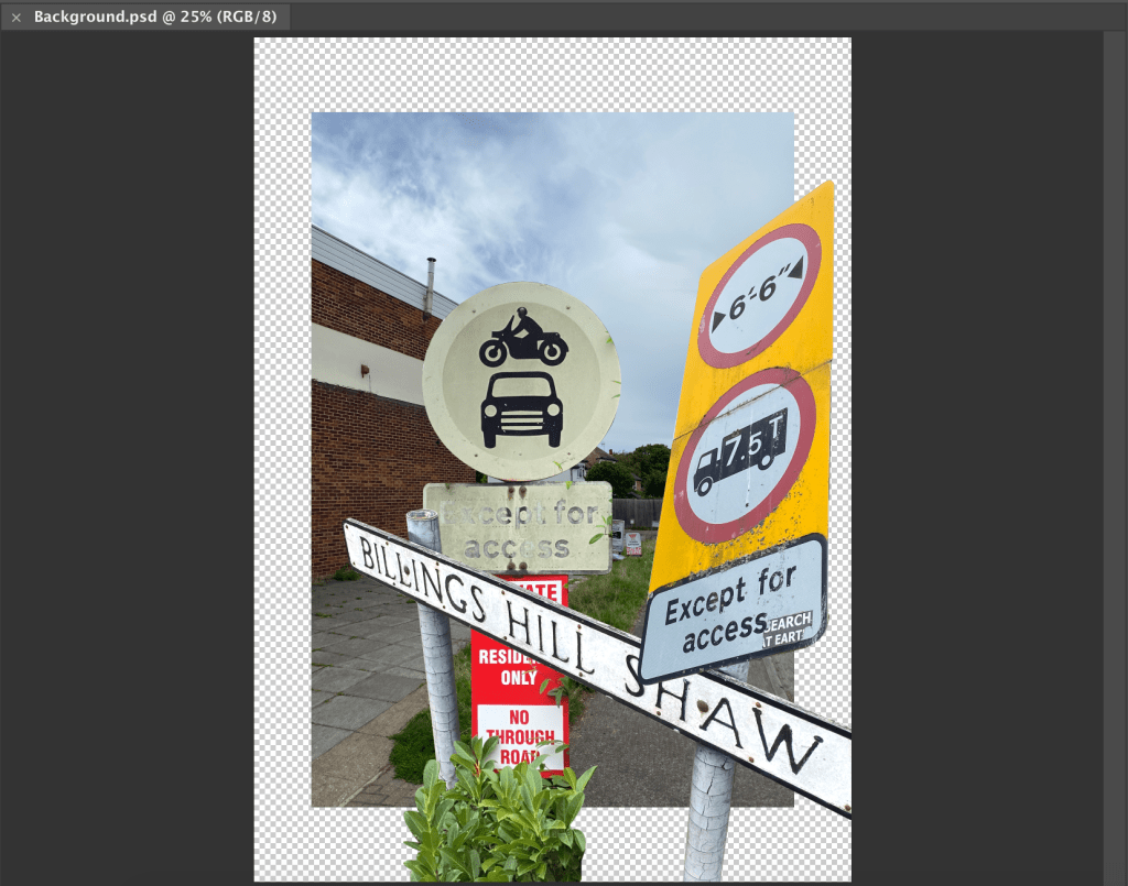
To create my poster/collage then, I started by dropping the photos into Photoshop, and cutting out the elements I wanted to use. This involved a lot of trial and error before I settled on a composition that I liked.
Once I had then transferred this over to inDesign, I wasn’t too sure of it, and felt it was missing something. So I had a brainwave and decided to had some more type, based on the lettering of my car’s number plate which would have been the final thing I saw after returning from my walk. This, then coupled with a hint of colour, picked from the rear number plate, helped to finish the poster off in my opinion.