‘Many designers have creatively exploited the limitations of how printing works, and in so doing revealed something of the process itself. For example, both the American designer Bradbury Thompson (1911–95) and the Italian designer Giovanni Pintori (1912–99) explored the visual colour mixing of CMYK, overlaying the four colours to reveal their mixing potential. The contemporary French designer Fanette Mellier works in a similar way, using a limited palette of translucent colours and overlaying them to build up deeper and darker colours.
The overlaying of different spot or CMYK colours in silkscreen printing, one on top of another, builds the artwork a layer at a time and creates a rich sense of depth. This can be seen in the work of printmaking studio Aesthetic Apparatus (http://aestheticapparatus. com/) and many of the silkscreen designs featured in the Gig Posters archive (http:// gigposters.com/).
Find examples of work that you think make the most of a limited range of colours, explore the overlap of colours, or in some way reveal the printing process in their approach. In your learning log, reflect on what makes these examples work on an aesthetic level. What can you take from their approach for your own work?
Using your examples as inspiration, do your own experiments to see what overlaying translucent colours and exploiting the overlaps of CMYK and other colour overlays can create. You may want to use a simple photograph of an object, a portrait or something similar as a starting point. Document your experiments by saving your different files and combining them into an overall design, such as a poster.’
My starting point for this task was to have a look at some different ways in which some print studios use overlaid colours to produce artwork. Aesthetic Apparatus are a printmaking studio which specialise in this style of working. A bold use of colour and composition produces very effective designs for packaging, posters and even snowboard designs!
Their style of working is a little more ‘grunge’-like than my own style of work. But it did give me an idea for some work. I decided to try a series of simplistic print designs, using relatively limited colour palettes and overlaid colours to see what I could create: Firstly I created some examples, just using the cyan, magenta and yellow colours to see what effects I could create. Without a doubt, the ‘multiply’ effect works best when using these colours, to get a really diverse overlaid appearance.
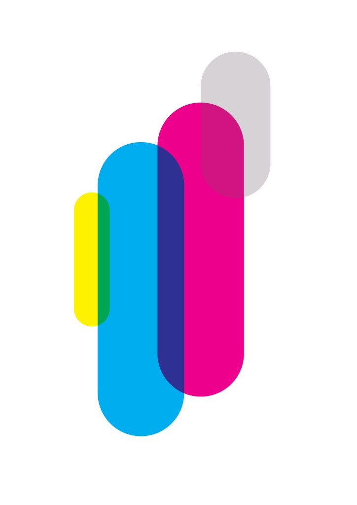
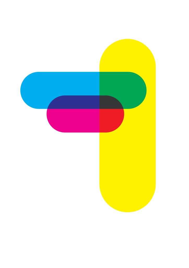
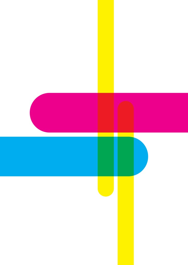
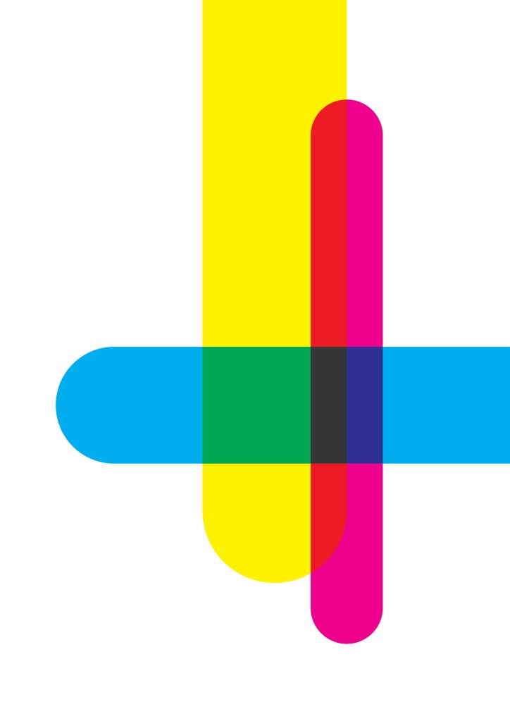
I then decided to use these same compositions but now using different, more subtle/softer colours:
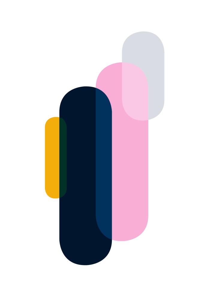
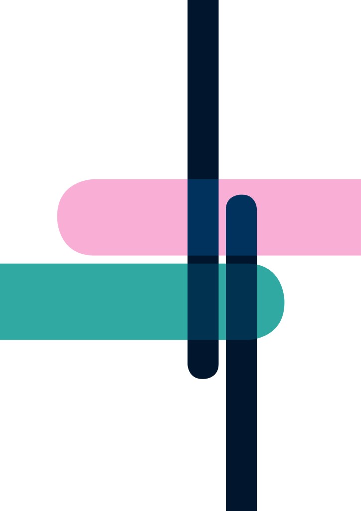


The abstract nature of the prints really meant that I could be quite playful with the composition and colours I chose. I experimented with a few different effects and ways of overlaying (as seen above), but I think the most effective I found, was the ‘soft light’ effect. I found that, especially with a slightly softer palette, they gave the best results (or at least the results I was looking for). I didn’t want the overlaid sections to become the focal points of the pieces, rather I wanted them to be relatively subtle in comparison.
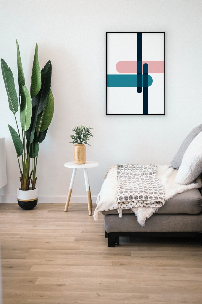
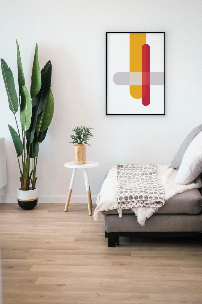
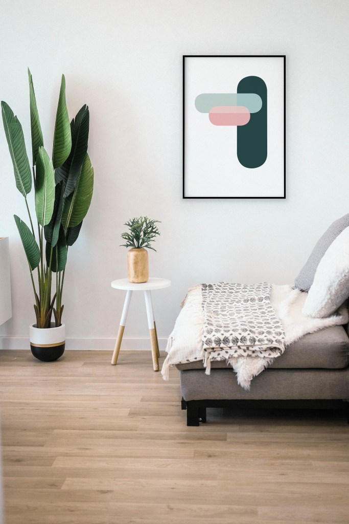
Rather than combining the different elements into one overall design, I think that these actually work best as standalone pieces or as a ‘collage’ style poster. I even mocked them up into a ‘scene’ to see how they might look as prints on a wall: