‘Look back at the work you’ve produced during the course and select the pieces that you feel best show off your talents as a designer. Put your work together into a portfolio, thinking carefully about the order in which you present the work.
As you develop as a designer your current work will tend to be the strongest work. Consider redoing or amending some of your earlier work to bring it up to your current standards. Sometimes it’s good to show a project in more detail, especially the ways in which you present ideas and rough drafts and develop these into finished outcomes.
Each piece can act as a prompt to talk about your work, so think about what you would say about each one. What information is important to demonstrate the context to the brief and the key points you want a client to know? How would you describe your creative process, your strengths and interests as a designer? You might want to rehearse this conversation by showing a friend your finished portfolio. Document your portfolio by presenting it digitally as a PDF or by photographing the pages.
At the start of Part Five you were asked to think about potential clients and begin the process of establishing a brief with a client. With this in mind, reflect on the process of selecting your portfolio, your final selection, and the things you have to say about your work. What are the positives in the work that you’re showing? Are there any areas that need further development? How could you re-order your portfolio to improve it? How have you described your creative process, both through your narrative and the examples shown? Document your thoughts in your learning log.’
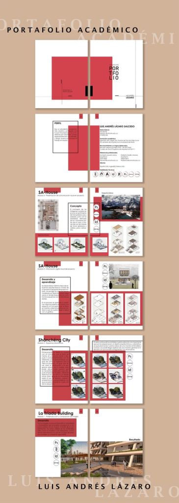
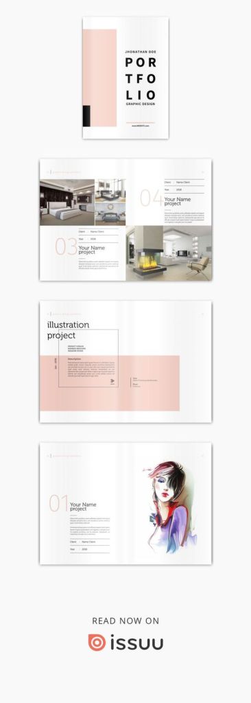
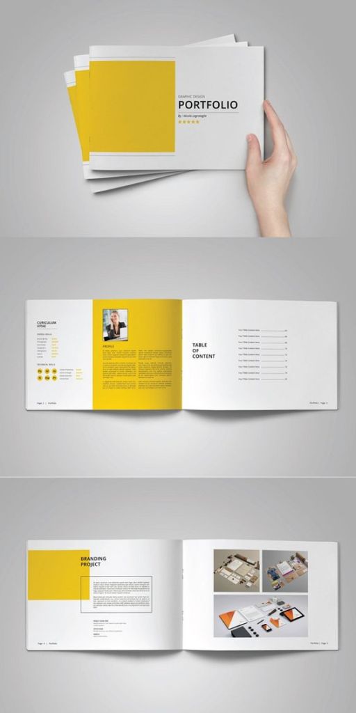
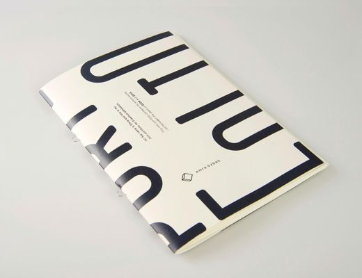
In order to get a feel for the task at hand, I spent a while researching and looking at others’ examples of design portfolios (I’ll attach some of the images below).
My general take from looking at these, and others, is that there is no right or wrong way to present your work. It is all very much subjective. However I do think some are more successful than others. I think there is a balance to be struck between making the portfolio itself a work of art, or having a nice, clean layout which places the emphasis on the work inside. I would have to say I lean slightly towards the latter in this instance.
I decided that I would aim for this sort of approach for my own portfolio. I opted to avoid any garish colours that might clash with the work itself, and just stuck to white – perhaps a little safe, but its what I feel is the correct approach. Using a playful composition I hoped I could add some design intrigue to the pages without distracting from the work itself.
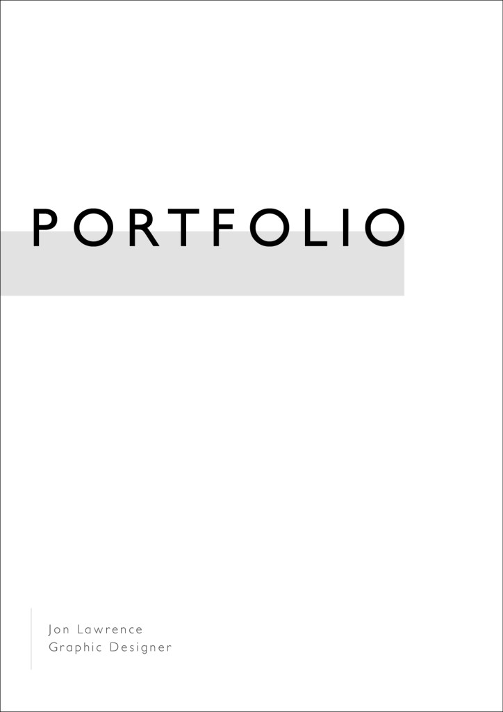
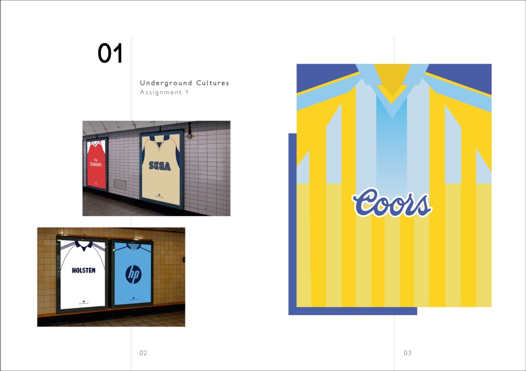
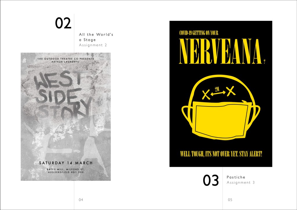
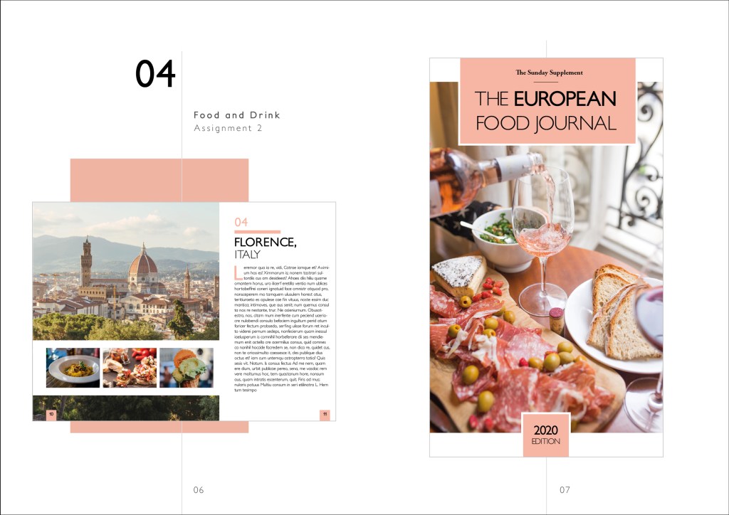
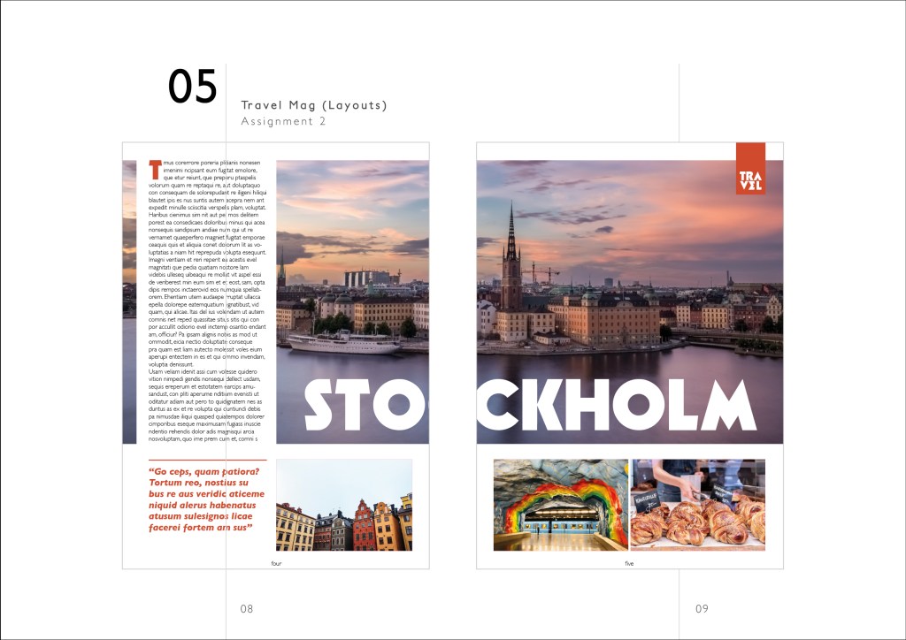
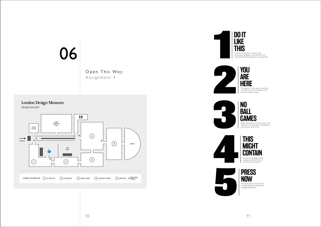
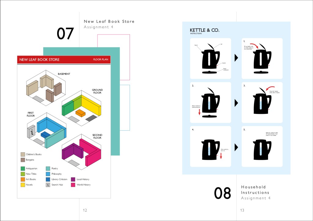
Overall i’m pretty pleased with the outcome of this. It was actually quite a nice experience to have a look back through the previous products and remind myself of some of the better work I have produced. I also feel very confident in perhaps presenting this to someone and having to talk through it explaining the concepts behind the ideas. All of which bodes well for the future.
