Assignment 4 – Open This Way

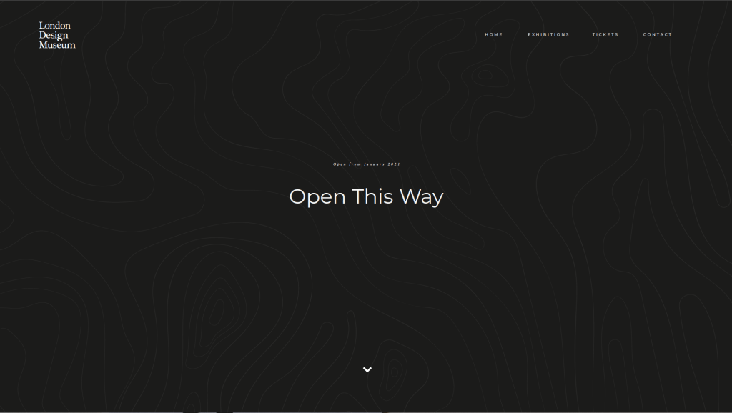
“London’s Design Museum is developing an exhibition on the legacy of information systems in our everyday lives. The show is called ‘Open this Way’ and charts the development of how information has been used to guide, inform, manipulate and organise our everyday social and private worlds. They want you to design an exhibition map, a signage system, and a proposal for a mini-website.

The exhibition is broken down into a number of different sections:

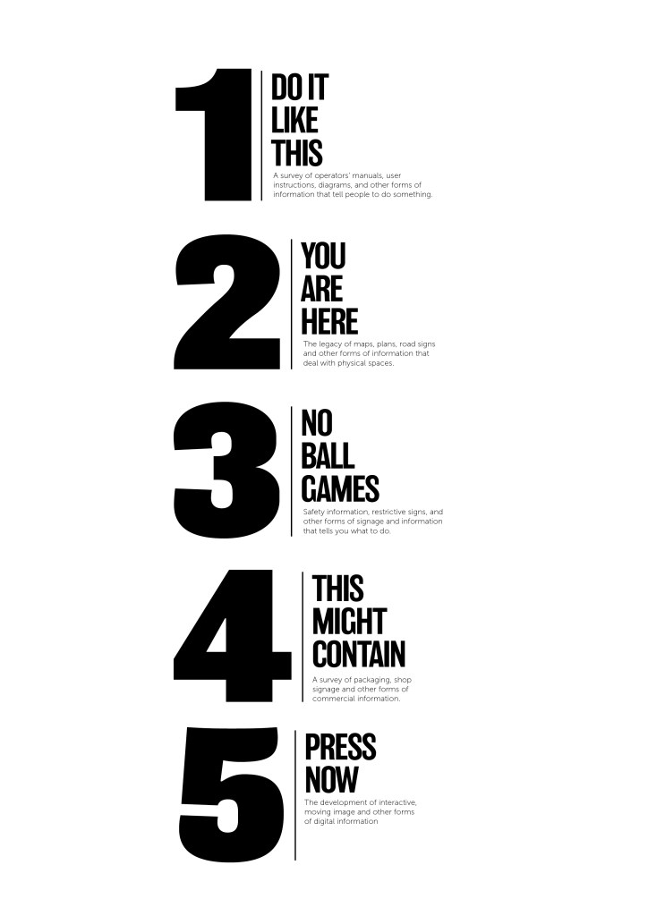
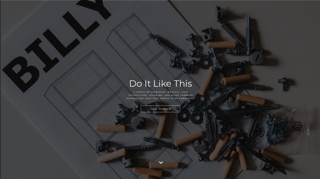
  1. Do it like this: a survey of operators’ manuals, user instructions, diagrams, and other forms of information that tell people how to do something.
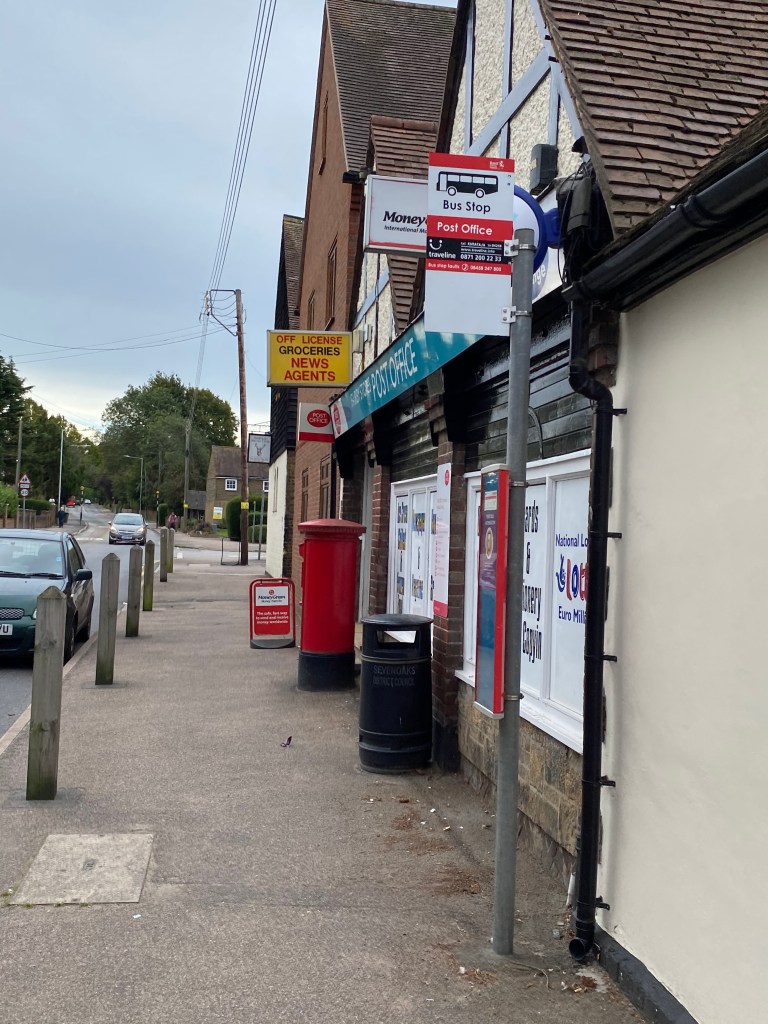
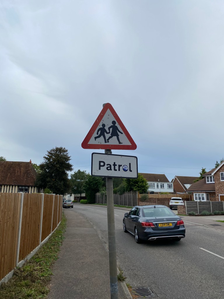
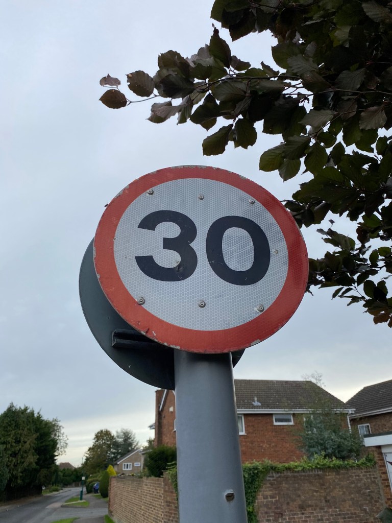
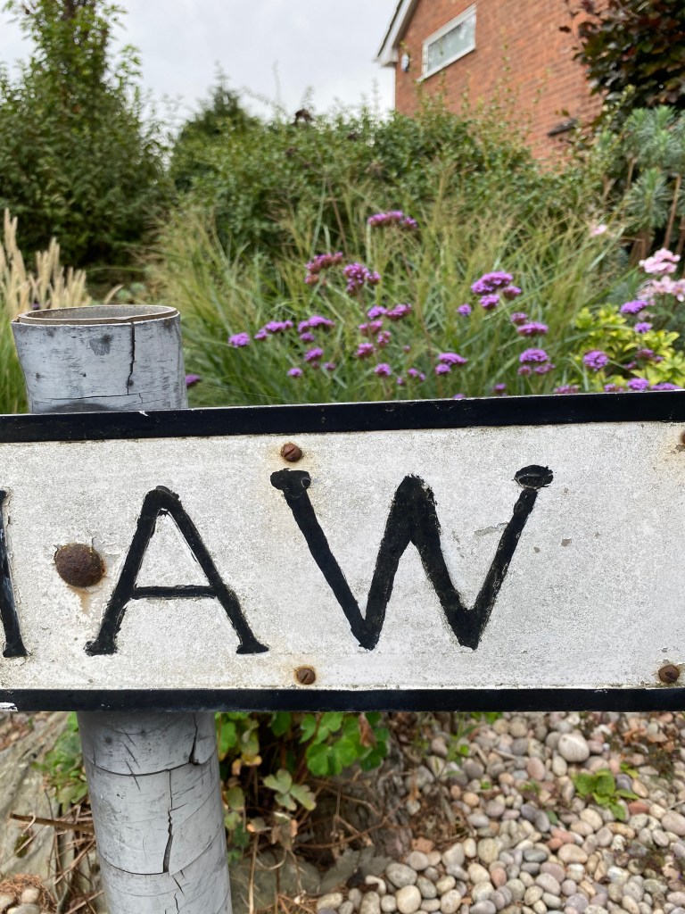
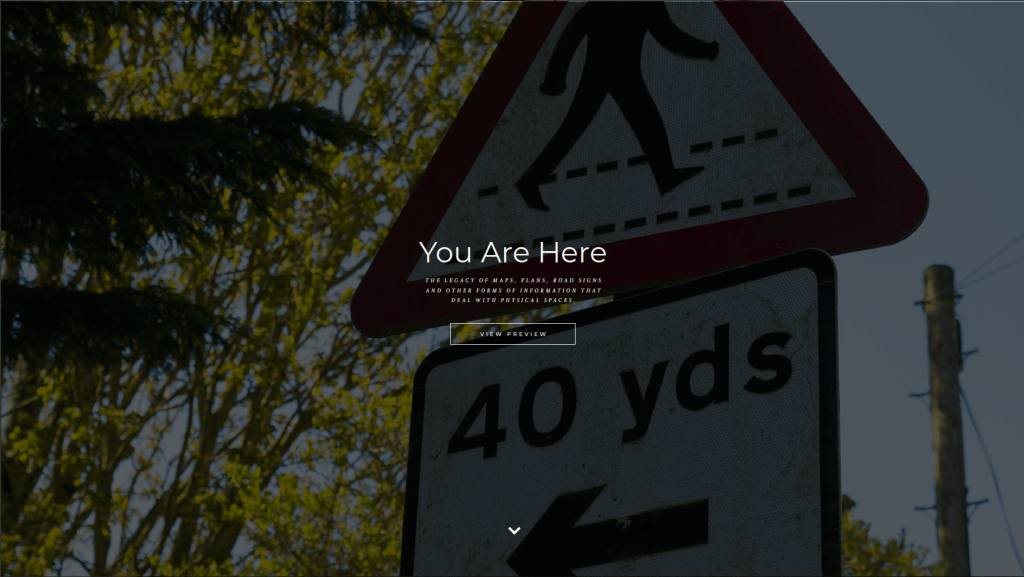
  2. You are here: the legacy of maps, plans, road signs and other forms of information that deal with physical spaces.
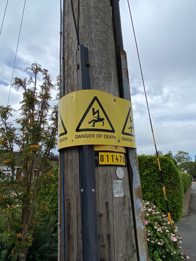
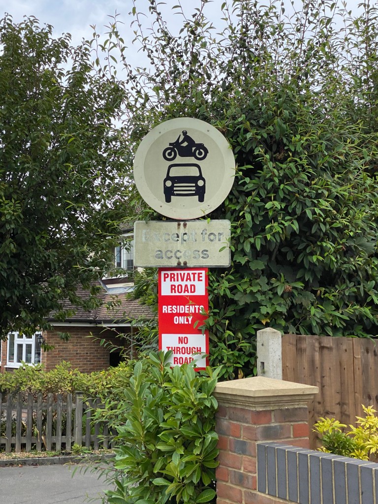
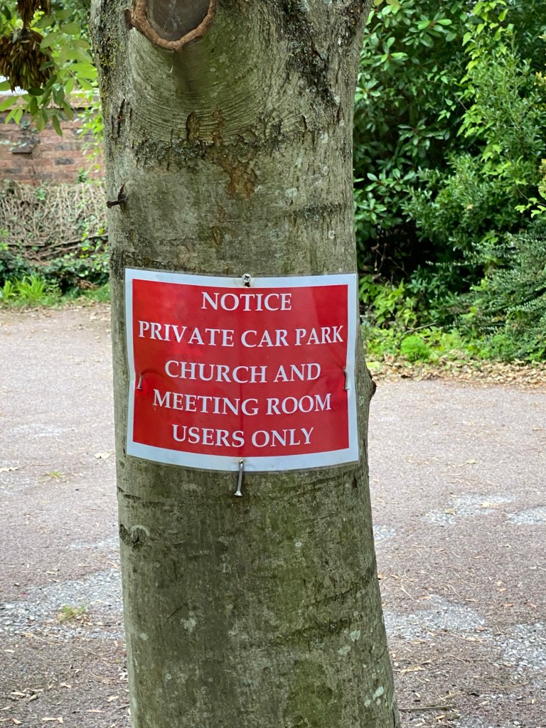
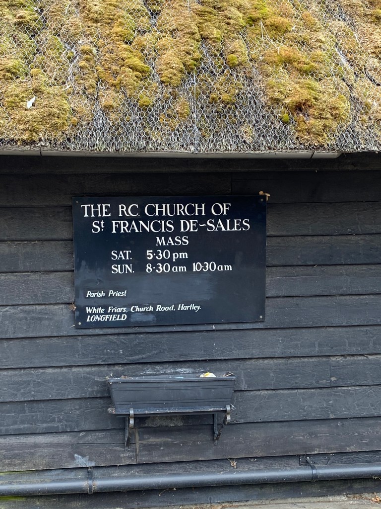
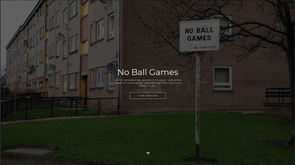
  3. No ball games: safety information, restrictive signs, and other forms of signage and information that tells you what to do.
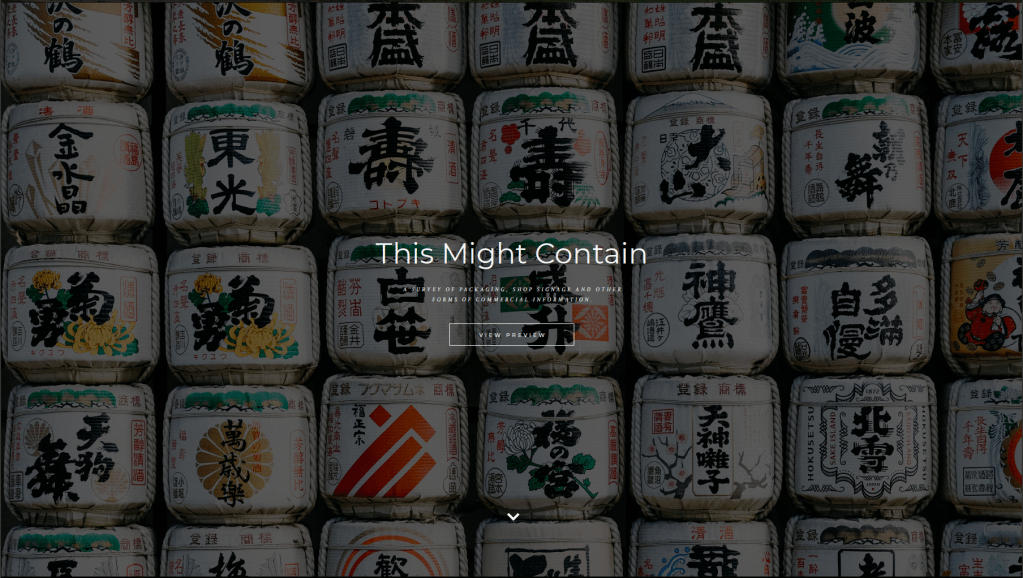
  4. This might contain: a survey of packaging, shop sign and other forms of commercial information.
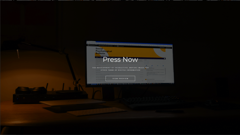
  5. Press now: the development of interactive, moving image and other forms of digital information.

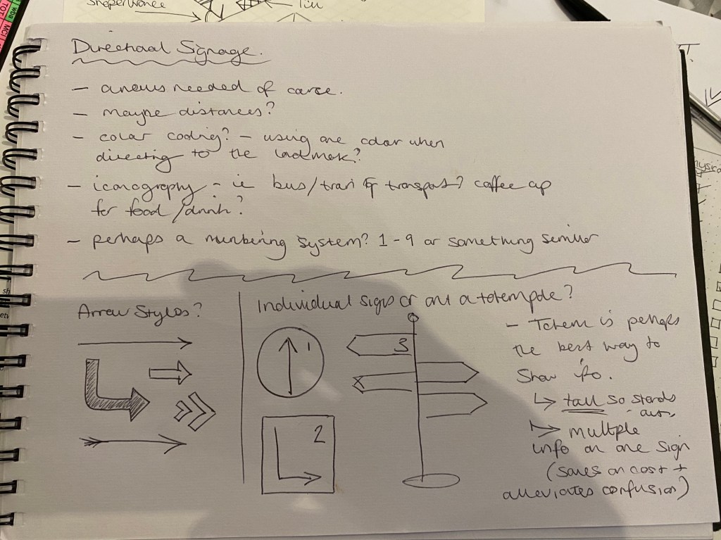
Develop a map and signage system that informs visitors what to expect from the whole exhibition, where things are and how to navigate around the space. Your map should fit onto one side of an A4 leaflet. Your signage system will be spread around the different rooms of the exhibition, so think about where your signs might go, how much information needs to go on them, and an overall design that can accommodate different amounts of information.

You might want to locate this exhibition in a real gallery, museum or other space. Alternatively, devise your own series of rooms.

In addition, develop some ideas about how this exhibition can be organised into a mini-website that will be linked to their existing site http://designmuseum.org/. They will commission a web programmer to make the site so they simply want an idea of how it could be structured and how it might look.”

So the starting point for this assignment was to look at some real world examples of exhibition maps, and how they deal with the space and information.

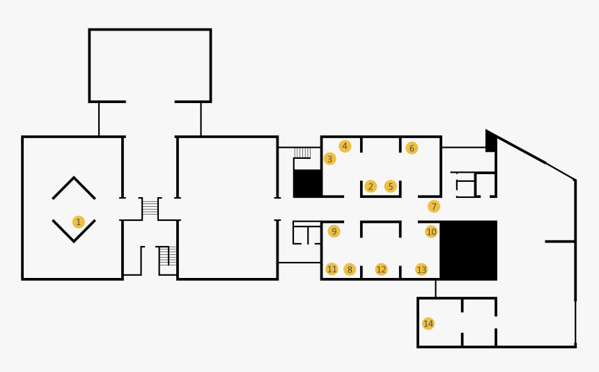
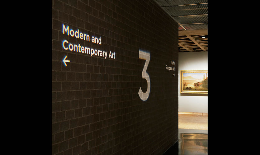
After a bit of digging I came across this 3D example which I thought could be interesting, though this particular one seems a little basic and difficult to understand in terms of which image corresponds to which room.

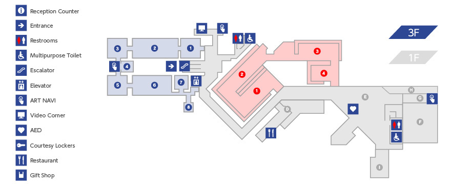
I then began to think about a simpler design, which would be a lot clearer to read on the A4 leaflet. This version above is effective and functional, but just a little plain. So in my mind, something similar could work…

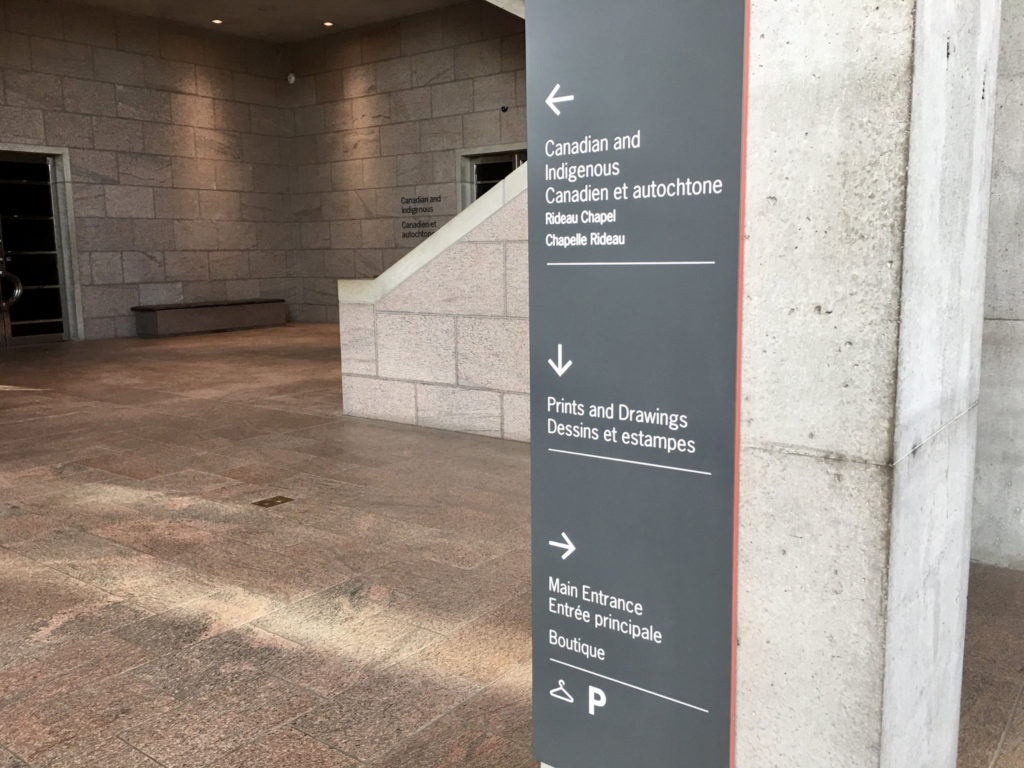
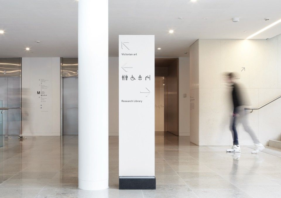
… which is when I found this example, and decided that something along these lines would be perfect! It was the best blend of clarity and looking nice that I had seen to this point. So now it was over to the sketchbook to sketch out a layout for my own exhibition.

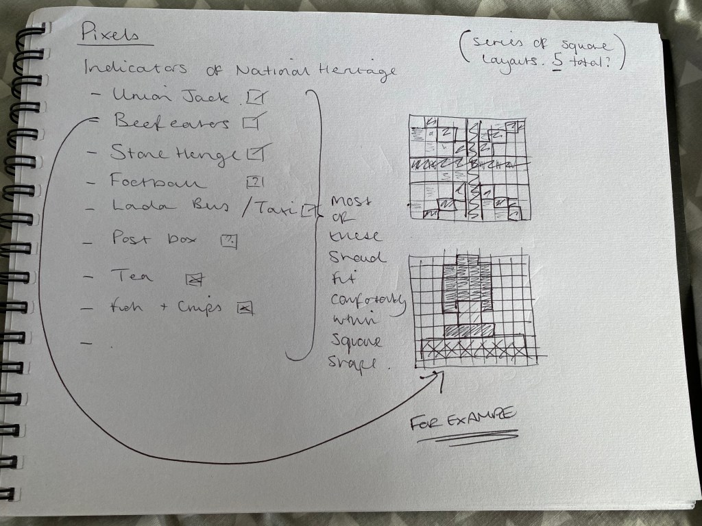
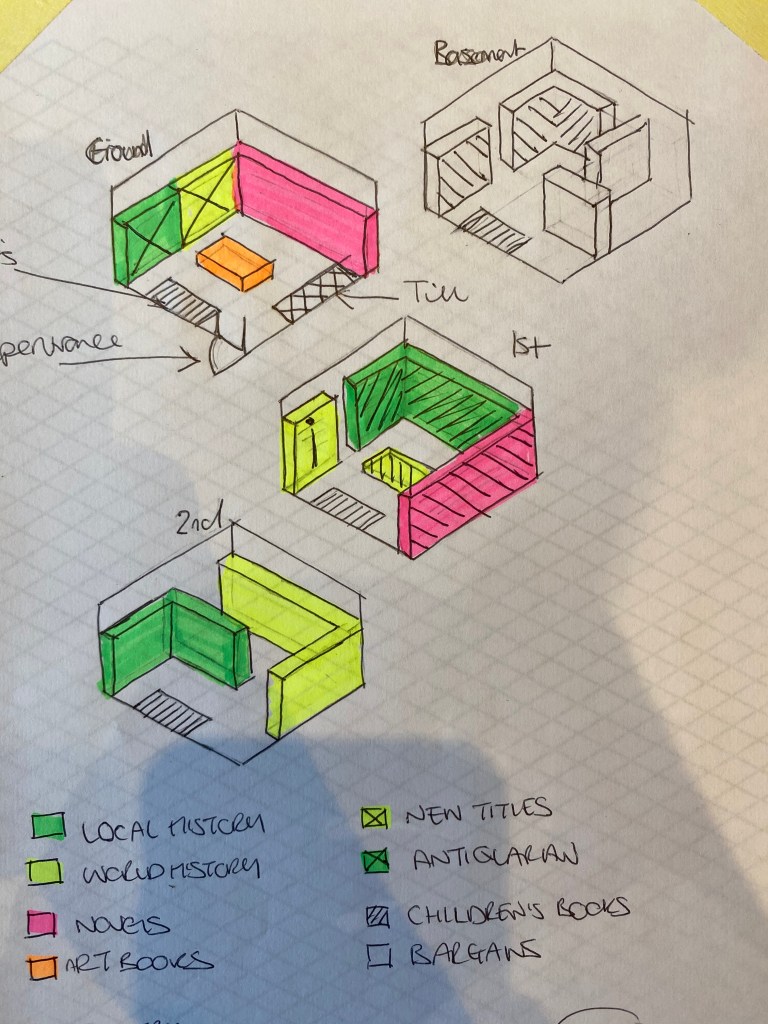
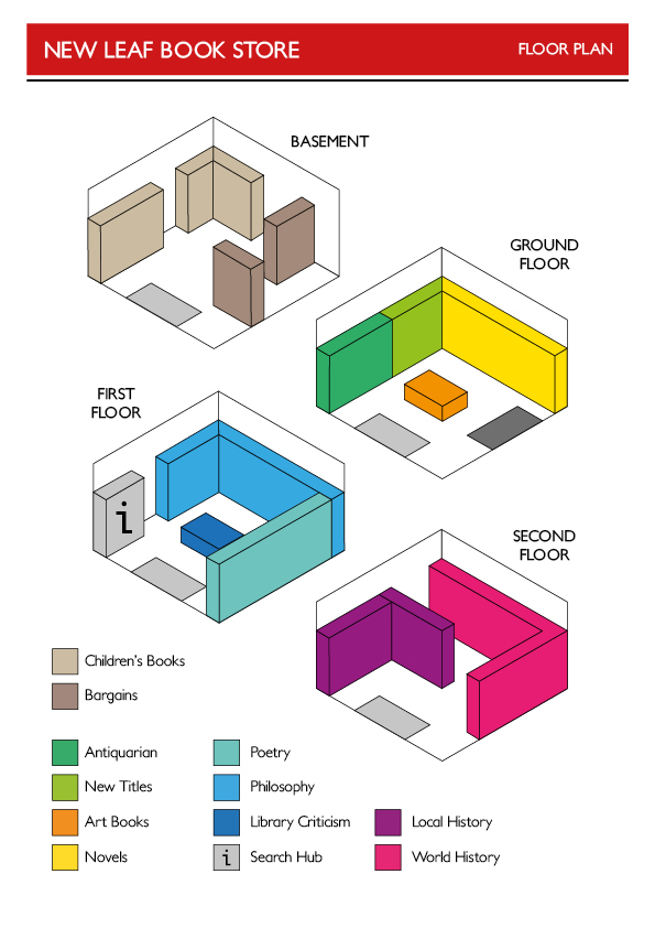
Having already had some experience in exhibition design in the past, this was a very enjoyable task and one I felt well prepared to complete.

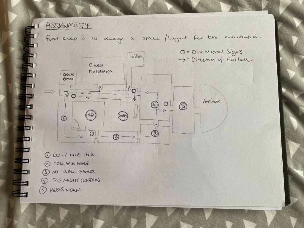
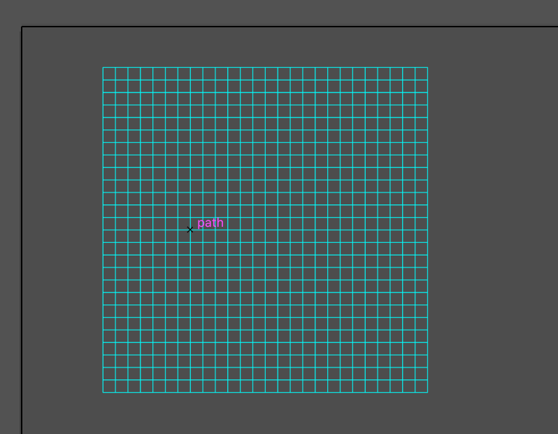
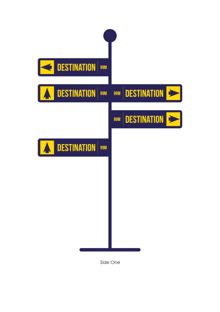
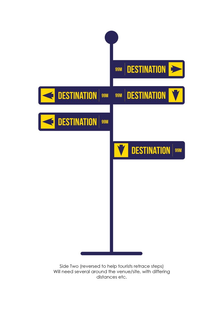
Very happy with this layout, I think it would work just right if put into practise. I also had to think about where to place the directional signage within the space. They’re labelled as the small circles in the above diagram – there’s four of them in the places that I thought made most sense (i.e. where there is more than one direction available).

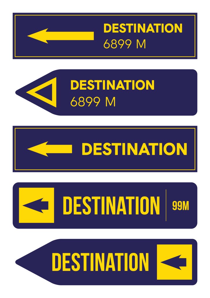
Then I had to think of what sort of design I wanted for the directional signs, and also the room labels (which I thought I would stick to the walls by using laser-cut vinyl).

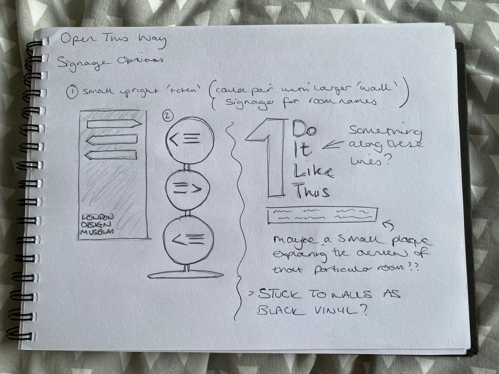
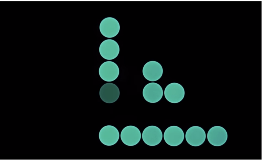
I couldn’t decide which of the two freestanding directional signs I preferred to begin with, so I thought I’d do both of them fully, and then decide which worked best from a functional point of view.

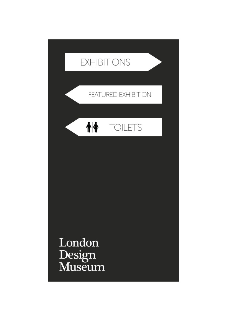
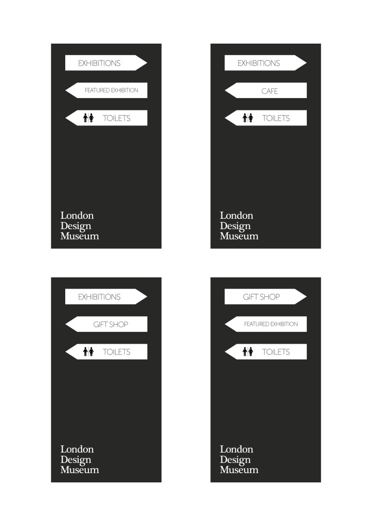
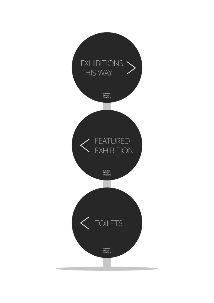
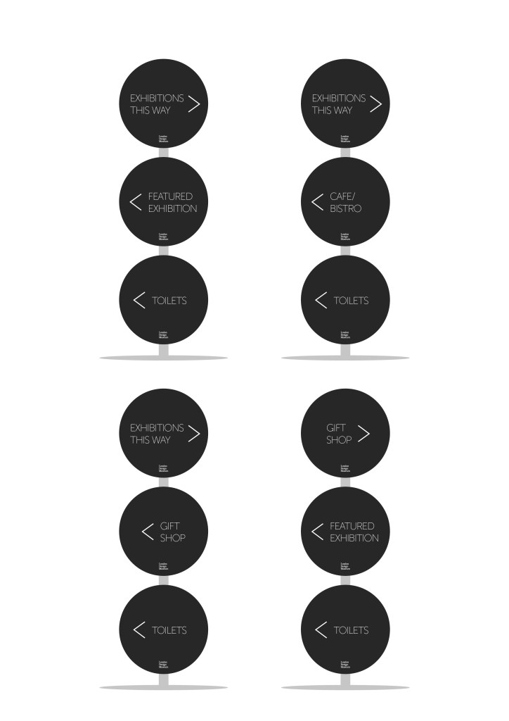
After some deliberation, I decided that the second design (the stacked circles) worked better for what I wanted. I was/am able to fit more information onto the signs, while they could also be removable and interchangeable, to suit the museum’s needs at any particular time.

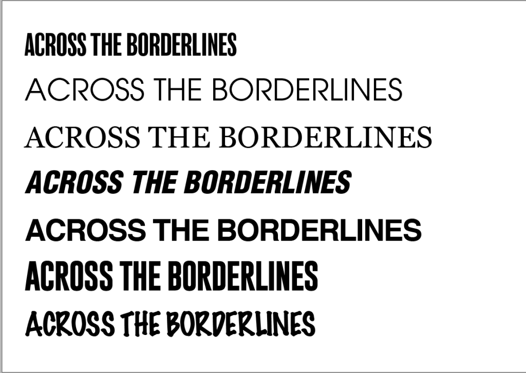
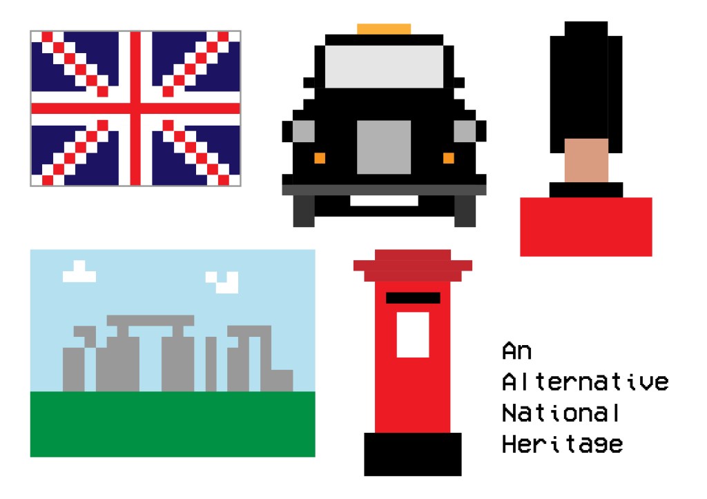
For the vinyl room labels, I went with my initial design – using bold numbering and lettering to clearly label each room, but also to draw peoples’ attention towards them with the aim of getting visitors to read the brief summary of each room before entering, to get a real feel for what each section is really about.

After settling on these designs, I needed to create the map for the A4 leaflet. I stuck with the muted colour scheme, so as not to draw too much attention away from the exhibits themselves. I think it also presents an element of class and sophistication.

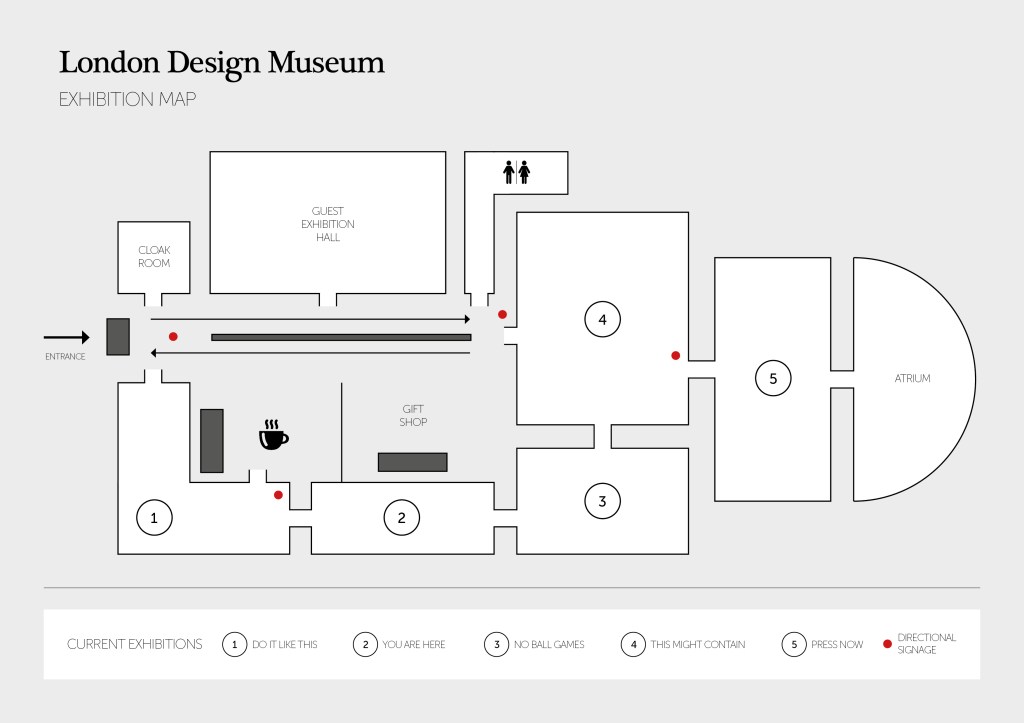
Using icons for certain things is usually a good way to clear thing up, especially if you have visitors who don’t speak English (in this case).

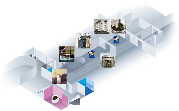
Finally, the museum asked for a website proposal. I decided to keep the design clean and classy to fit the rest of the aesthetic that I’d aimed for with the signage and map. I used images to give a flavour of what each section may contain, with click through links if the visitor wanted to find out more about a particular part of the exhibition.

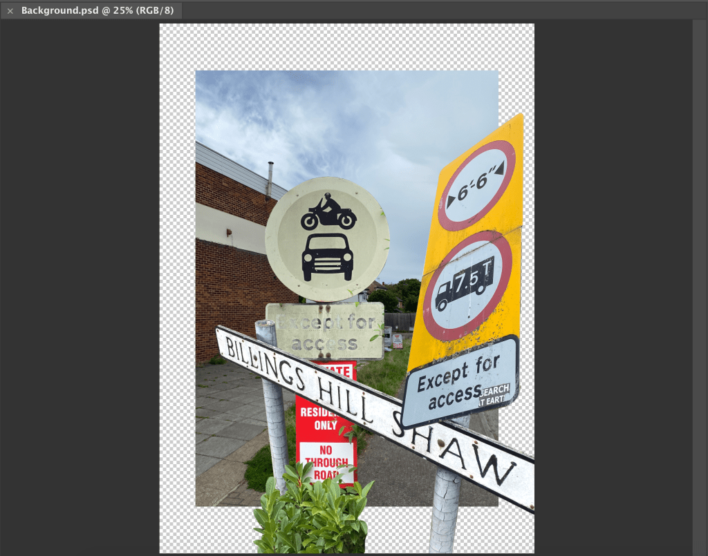
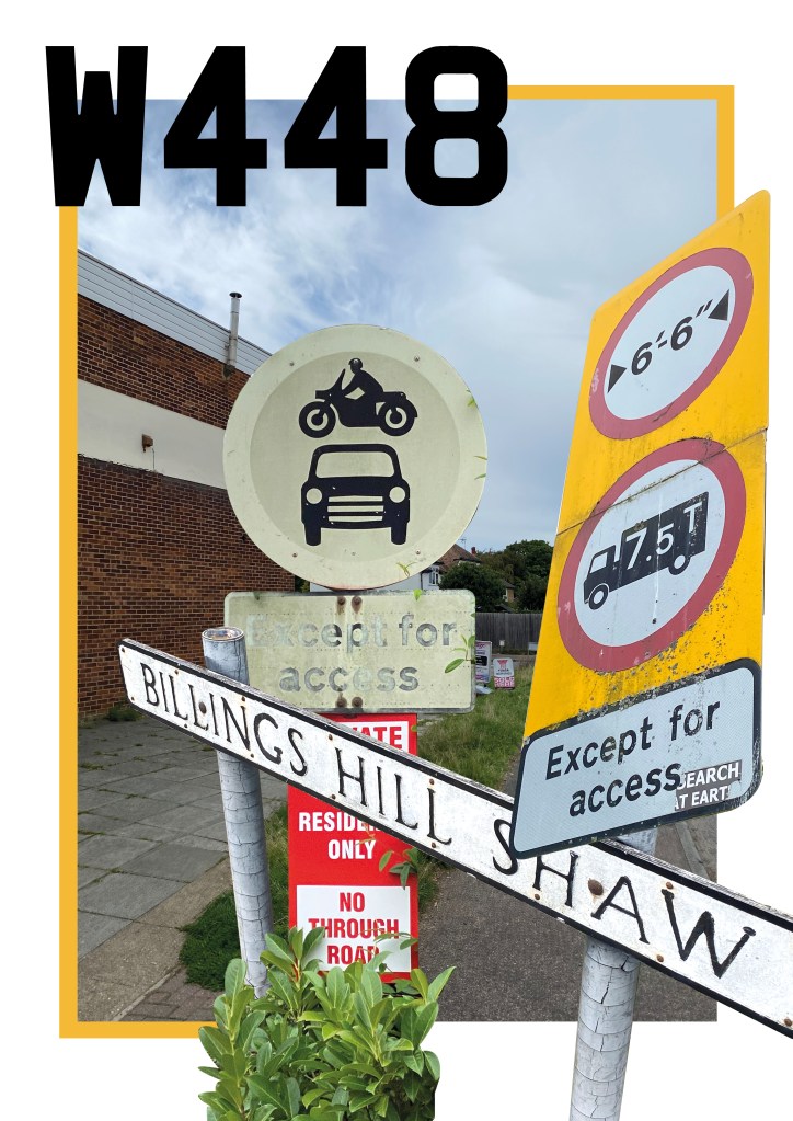
Annoyingly the single image (all the slides stitched together was too large, so these screen grabs will hopefully suffice).

Links
https://www.deutsches-museum.de/en/exhibitions/materials-energy/electric-power/exhibition-map/
https://www.fujibi.or.jp/en/visit/museum-map.html
https://www.pngitem.com/middle/hxxhwoJ_ask-at-the-front-desk-for-a-scavenger/
https://www.pinterest.co.uk/pin/77194581090135382/
http://www.smartgiant.co.uk/getting-there

Road Trips

‘A new TV programme exploring historic road journeys around the world wants you to pitch some ideas for an opening credit sequence. The programme will be showing car and cycling journeys along America’s Route 66, Land’s End to John O’ Groats and the Tour de France.

Develop your ideas for an opening credit sequence through a storyboard. The opening sequence needs to give a general feel of the programme, as well as presenting the name of the programme, the different journeys it’s going to explore and the name of the presenter.

This exercise is an opportunity to explore moving typography, drawing on the visual cultures of roads, maps and signage.’

Well, where to start… The idea of drawing and storyboarding is something that fills me with dread, but hey ho I gave it a go!

I started off be doing a bit of research on all of the individual routes, and the landmarks that would appear along them. Below are a gallery of landmarks for each route:

Then I began to sketch plans of what I wanted to go in each section of my storyboard/title sequence:

Using these as a starting point, I then settled on four scenes which will transition into each other. Hopefully my story board/draft below does this justice…

With this part decided on, it was then onto deciding the font for the title and cast names:

With bold being best, when it comes to the title font, I decided on option 4 (above) which is Helvetica Neue Black Oblique Condensed. The italicised nature of the font gives a nod to the movement and dynamism of the programme itself.

I think overall with this task, the final product could probably have been better, or neater perhaps. But I really put a lot of effort into this task, which was quite a way outside of my comfort zone, and I was especially pleased with the concept that I had come up with.

Links:
https://www.youtube.com/watch?v=c5p6uUR3nF0
https://bellefrance.com/blog/guide-to-tour-de-france-sightseeing/
https://www.alamo.co.uk/inspiration/top-attractions-along-route-66/
https://www.cyclinguk.org/routes/lands-end-john-o-groats

Title Sequences – Research Point

‘The graphic designer and film-maker Saul Bass saw the creative possibilities of making film title sequences more than simply a typographic exercise in delivering information, with his ground-breaking sequence for Otto Preminger’s The Man with the Golden Arm (1955); this was followed by the development of a form of moving kinetic typography for Alfred Hitchcock’s North by Northwest (1959), Vertigo (1958), and Psycho (1960). Since then, the creative use of typography within film and television programmes has become the norm. Find examples of opening credits that you think work particularly well, reflecting on how designers have balanced information needs with a creative introduction to the content of the film or programme.’

A few title sequences that immediately spring to mind are Star Wars (any of them!), Dr. No, and Se7en. All classic movies in their own right, but the title sequences especially stand out for their unique graphic elements.

Star Wars
The iconic thing about the Star Wars franchise opening credits are obviously the scrolling pre-text to the movies’ content, the words seem to vanish off into the black abyss of space via the use of a clever perspective shift:

Secondly, Dr.No. This sprung to mind having only recently rewatched it, but unlike the newer Bond films, this one makes use of a series of coloured spots and lines to add movement and intrigue to the sequence – perhaps indicative of the era. Although nothing is particularly revealed during this, the sequence, paired with the classic Bond theme song leaves a lot to the imagination!

And lastly, the iconic neo-noir psychological crime thriller – Se7en. The use of hand drawn scrawls, and glitchy text movements really add to the uncomfortable nature of the plot. They are representative of the psychological/maniacal factor behind the storyline, and set the scene perfectly for the viewer.

With all of these films at least 25 years old now, is there an arguement to say that the art of a graphic-based/enhanced title sequence has been lost…?

Links:
https://www.creativebloq.com/design/top-movie-title-sequences-10121014
https://www.youtube.com/watch?v=7jK-jZo6xjY
https://www.youtube.com/watch?v=wD-YR-3KmyE
https://www.youtube.com/watch?v=-k2gsEI34CE

Pixels – An Alternative National Heritage

‘A Sunday paper is running an article called ‘Pixels – An Alternative National Heritage’ looking at the legacy of onscreen technology over the last 40 years. They want you to playfully represent traditional views of heritage through the lens of the pixel.

Working within the limitations set by a grid of square pixels, and a range of no more than six colours, recreate a range of national landmarks, personalities, characters, flags, landscapes, names or other indicators of traditional national heritage.

Set your grids to any size and dimension, but remember that they want the qualities of the pixel to be dominant so the fewer pixels you use the better. You may want to work on graph paper, work at a low resolution on Photoshop or set up your own grid system on your DTP package.’

The first question I had to ask myself with this task was what are the things that make us British, and what do I associate with our heritage. Below is a short list of the things I came up with…

Very stereotypical, I know. But I figured that is sort of what this brief is asking for! I then chose a handful of the above to think about and develop into ‘pixellated’ illustrations.

Using the above grid to help me plan and draw out my illustrations, I ended up with the below result: Which I am pretty pleased with, having captured what I feel is a great snapshot into the British heritage.

Pine Marten

‘A small publishing company called Pine Marten Publishing wants to develop an online presence. They produce a wide range of books that focus on different aspects of nature writing: short stories set in distinctive natural landscapes, volumes of animal, plant and insect illustrations and photography, volumes of poetry and travel guides. They employ traditional paper-making, printing and binding techniques to produce limited editions of their books and pamphlets, and pride themselves on their craft ethos. As a consequence they have tried to avoid the internet, but as many of their customers are abroad, they have realised they need a website to be economically viable for the future.

Pine Marten have asked you to research the competition online, analysing the visual feel, layout and navigation of small and large publishing companies as well as online craft and book shops. They want links to some of these sites and some narrative about what makes them successful or which elements might suit Pine Marten’s needs.

The company also needs advice on what is currently the best way to present and sell items online. They would welcome any suggestions on which kinds of technology would best suit their needs, bearing in mind that they want to update their current stock on a weekly basis. As a small company they are keen to know whether there are any freely available web design tools or shops already online they could use instead, perhaps linking together different elements from different sites.

Finally, they want a website to show their back catalogue of books, the different ranges they offer, as well as their current stock and forthcoming publications. They want to sell this material online, provide links to a range of organisations such as the RSPB, and create a space for writers and customers to review and write about their work. They want you to suggest a suitable way to organise and navigate this content into a menu by developing flow diagrams of how the content links together as well as mock-ups of how a number of the web pages will look.

Put all your research, links to examples, recommendations on existing options, flow diagrams and mock-ups into either a PDF document that can be emailed to the client, or a series of web pages they can view.’

I’ve touched on this type of thing in my working career already, where a client comes to you wanting advice and help on how to update and refresh their brand, and really bring it up to scratch and in line with what competitors are doing. Usually it’s a full rebrand that customers want doing, but in this case it is just a website build, and direction consultation.

The first place to start was to research the competition, and understand what Pine Marten needs to have in order to compete. (All of this research is in the document supplied with my submission)

I then discussed potential payment platforms for the website, followed by more example of competitors’ websites. And finally rounded off the consultation by providing a flow diagram of how the website would function, and a taster of what the homepage could look and feel like.

HTML – Research Point

‘You can distinguish a HTML from a PHP page by analysing the kinds of data being used, seeing whether a page is static or has options to update it live (for example by offering a log in option), or simply by looking at the URL address to see if there’s a .html or .php after the page name. Similarly, Flash pages can be spotted by the kinds of information they present and whether it’s animated or interactive. Scan through some of your regular web pages and try to work out what scripting language has been used to create them.’

I would say in general, most of the websites we use on a regular basis are HTML based. I know one of the sites I use most regularly – skysports.com is just that. The easiest way to find out what site has been built in, is by right clicking and inspecting the pages properties. This will tell you everything about the back end of the site.

Flash sites are rapidly becoming a thing of the past due to other options such as HTML5 and WebGL have become much better options… “open standards like HTML5, WebGL and WebAssembly have matured over the past several years” (https://www.hitc.com/en-gb/2020/02/11/is-adobe-flash-player-shutting-down-2020-why-its-going-away/)

User Interfaces – Research Point

‘User interfaces are everywhere, from mobile phones to television remote controls, from washing machines to car steering wheels. Spend some time consciously looking at the interfaces that you regularly come in contact with and reflect on how well they work as interactive devices. Could you understand the function of the buttons without reading the instruction manual? How easy or intuitive are they to use? Is the interface using visual metaphors to help you? What responsive cues are you getting back from them?

Reflect on your experience of these interfaces from a design perspective. Look at how they’ve been constructed and think about any possible improvements you could make. You may want to widen your research and look at current developments in other forms of interface design or trace the development of interfaces you have a particular interest in.’

User interfaces, or UI as they’re commonly referred to, are everywhere in everyday life. Perhaps this is a sign of a good UI, that they often go unnoticed. Common examples are things such as TV remotes, car steering wheels, microwaves, mobile phones, the list goes on…

I suppose one of the key features of a UI is it’s ability to be instantly understood. A good example of this is, if you were to pick up a TV remote of a TV that isn’t your own, I think 99% of us could immediately work out how to turn the volume up or down. This is not luck, this is due to a cleverly designed button, with labels. Often a longer button, featuring a plus (to increase) and a minus (to decrease). They are more often than not, in a vertical format, another clue as to what the button’s purpose it, again up to increase and down to decrease.

A second example might be found inside your car. The importance of an effective UI is paramount inside a vehicle. The driver has to concentrate on the road, so any button or interface needs to be super easy to understand and activate so as not to distract the driver’s attention. These buttons are often found on steering wheels, where they are easily accessible to the driver. Cruise control, volume and even next track buttons can all be found on them. They often work in a similar way to the aforementioned tv remotes in that plus and minus symbols are widely used, and repeating arrows used to denote a ‘next’ or ‘previous’ button.

One improvement, or development I have seen to this recently, is the introduction of gesture control within cars. BMW especially have begun to introduce gesture control to their newest models. Namely, this eliminates the need for so many buttons, and allows the driver to operate the interface system with either their voice or by making very simple hand gestures. A very simple solution indeed! As with all new developments and technologies though, there is still room for improvement, but this is certainly something I see become commonplace in cars within the next 5 or so years.

Public Lettering

‘The signage of previous eras remains with us in the form of street names, plaques, older shop fronts or other signs that have never been removed. Streets and public buildings are therefore a potential source of typographic archaeology in which we can discover forgotten or obsolete forms of signage, identify a wider history of typographic styles, and pick out different forms of signage from hand-rendered, metal cast type to amateur hand-written signs. Different places have different traditions or vernaculars of typography and signage, which gives each place a sense of its unique identity. However this wealth of public signage also creates problems as signs compete for attention, take up space within our field of vision or interact with one another in unexpected juxtapositions.

Graphic designer Phil Baines developed his Public Lettering project in 1997 to document some of the typography he encountered on a walk in central London. Much of this typography is from public signage, while other examples are drawn from things like manhole covers and dates on buildings. See http://www.publiclettering.org.uk/

Following Phil Baines’ idea of taking a typographic journey, use drawing and/ or photography to document the forms of public typography, lettering and signage you encounter on a chosen walk. Reflect on what you find and compile your images in a poster, small booklet or other format than shows the chronology of your walk. Develop some narrative around your images. For example, identify and reflect on examples of good and bad signage from an information perspective, examples that you found interesting as a designer, and others than might reference the history of typography in some way.’

So here are the photos from my walk… I live in a pretty sleepy little village, so there’s not exactly an abundance of interesting things, but I found what I could!

To create my poster/collage then, I started by dropping the photos into Photoshop, and cutting out the elements I wanted to use. This involved a lot of trial and error before I settled on a composition that I liked.

Once I had then transferred this over to inDesign, I wasn’t too sure of it, and felt it was missing something. So I had a brainwave and decided to had some more type, based on the lettering of my car’s number plate which would have been the final thing I saw after returning from my walk. This, then coupled with a hint of colour, picked from the rear number plate, helped to finish the poster off in my opinion.

Directional Signage

‘Developing effective signage requires a number of things: understanding what information is required, finding a suitable way of displaying it, and finding the best place to locate it. With this in mind, think about how you’d create a series of signs to direct tourists from a local landmark to cafés in the area and to transport networks such as the nearest bus stop or train station. Use your own location or experience of being a tourist to site this exercise. What information do you need to put on your signs? How many different signs do you need and where will you put them? Think about tourists wanting to go to the landmark as well as needing to know how to get back again.’

Signage, in particular directional signage is something I’m very familiar with, dealing with it on pretty much a weekly basis at work. So I felt in a good position when it came to attempting this task.

Now one of the most important aspects of directional signage is that it needs to be readable from either a distance, or in a crowd. This means either the signs end up quite large, or more commonly are on a totem-style pole which enables them to be seen when in a crowd. Also it is very important, as the brief alluded to, that tourists are able to retrace their steps to get back to somewhere, this usually means that the signs are double sided – so what they show on one side, is reflected on the reverse.

Colour scheme is also important, it can determine what parts of the sign belong to a certain area for example. Or simply, it just helps them to be legible.

So I decided to go with the totem pole idea as I believe it to be the most effective, above are some options I came up with for the sign part of the pole. Settled on a yellow over blue colour scheme as it really highlights the important aspects of the signs, whilst being more aesthetically pleasing than a basic black/white combo.

The bold arrows are clear in their direction, and the use of a condensed font means that the point size can be larger, and more info fitted onto each sign – both contributing to making the overall sign a clear focal point around a venue. In terms of numbers of signs – you don’t want so many as to overwhelm and confuse potential visitors, but not too few that they are able to get lost. But putting a number on a fictional venue without knowing its size is a difficult task.

New Leaf Book Store

‘A large second-hand bookshop that occupies an old Victorian terrace wants you to create a three-dimensional diagram of their store to help customers find their way around. The shop is spread over four floors: bargains and a children’s section in the basement; novels, art books, antiquarian items and new stock on the ground floor (where the main entrance is located); philosophy, poetry, literary criticism and theory on the first floor; world and local history on the top floor. The shop owner is aware that online rivals have the benefit of search engines to help customers find what they want, so welcomes any creative ideas you have to help find alternative solutions for customers seeking specific titles.

Think about the various levels within your diagram: the four floors, the sections within them, and the various book cabinets and shelves within the sections. Choose an appropriate form of three-dimensional representation to present the information you’ve been given.’

I have to confess, the only book shop I can remember going into in the past 10 years is a Waterstone’s, and even then they are usually at the airport. This meant that I was going into this task somewhat in the dark about what a traditional, in particular, second-hand book shop is like. However, I took this as a blessing as I feel it gave me slightly ‘free-er’ view on how to tackle this task.

I first had to research what was the best way to attempt a 3d drawing as it is something I have very little experience in. But I found that the industry practise is to use a 30 degree grid to work up your initial sketches on. So I found a grid, printed it and got cracking.

I have to say for my first time doing this kind of thing I was very pleased with my initial sketches/outcome. Annoyingly a lack of colouring utensils where I am currently am hindered the colour scheme somewhat – but this was easily fixable once I translated these designs to a digital format.

To tackle the issue of search engines, detailed in the brief, I took inspiration from a recent library visit, where I discovered the self-service search machine. It basically allows you to search through criteria until you find what you’re after, and then it provides you with the location of the book within the library. I thought a similar system could work for the book store, with a ‘search hub’ as such on each floor(?)

As I alluded to earlier, the colour scheme was completely fixable once I had drawn out the plan in digital format. To do this, I scanned in the sketches you can see at the top, and put them on a locked layer on Illustrator. I then essentially traced over the lines, sticking to the strict 30 degree grid. I really pleased with the outcome, especially considering I had never done anything like this before! I could definitely see this being printed out and displayed at the entrance (and on each floor) of a book store. I also think the stacked nature of the layout emphasises the fact that the shop is divided onto four floors of a Victorian terrace.

Design a site like this with WordPress.com
Get started