From Source to Sale

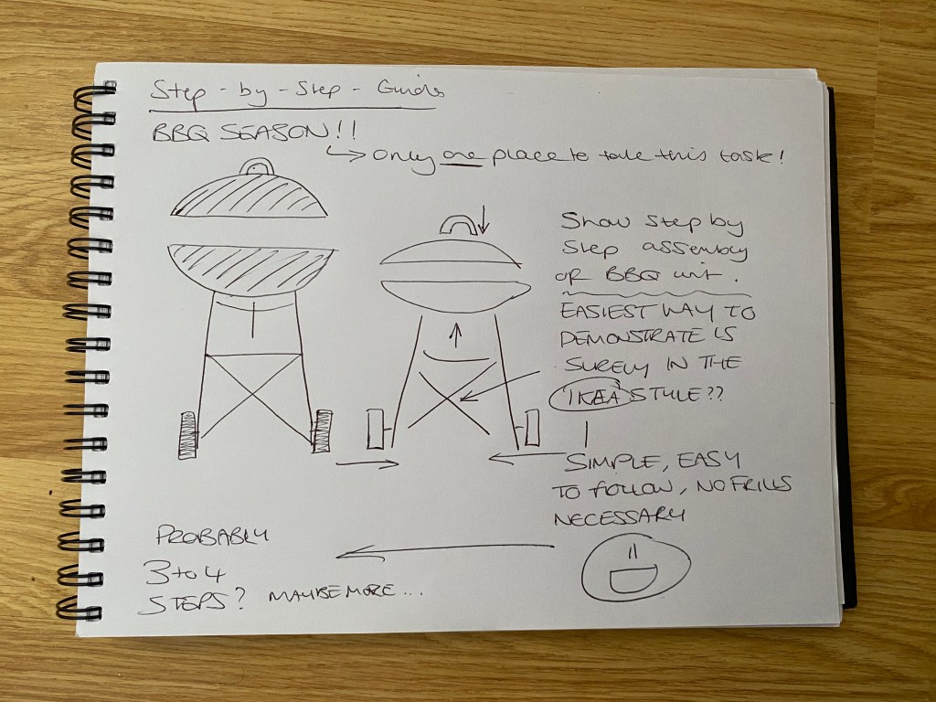
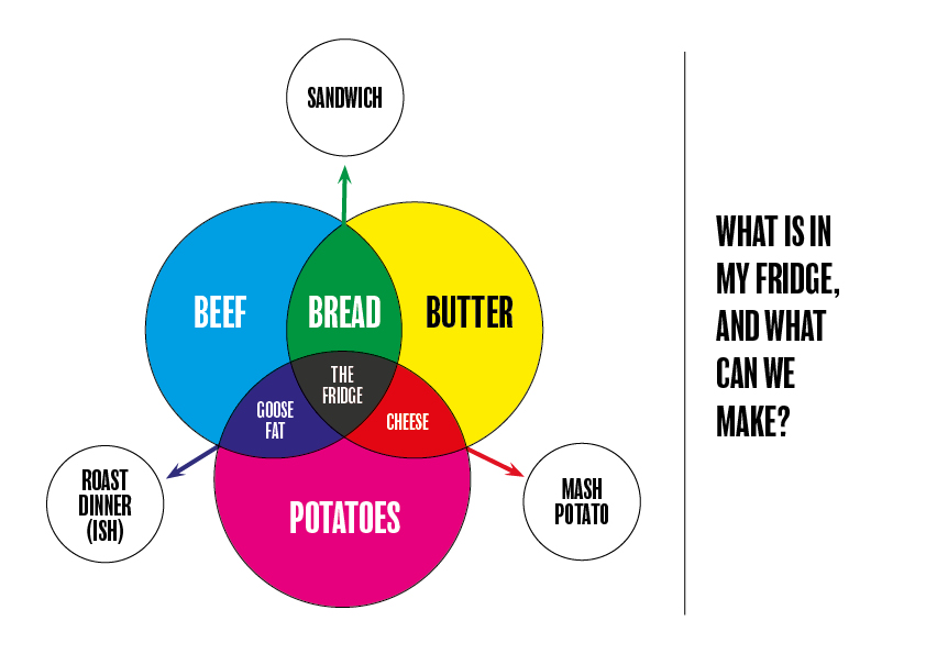
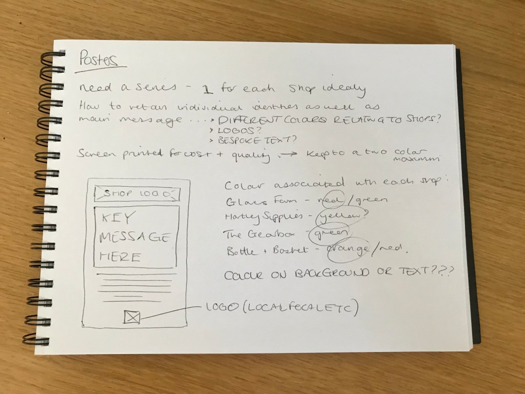
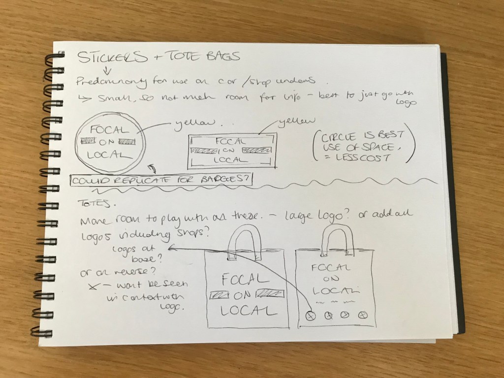
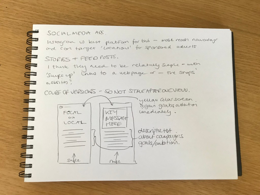
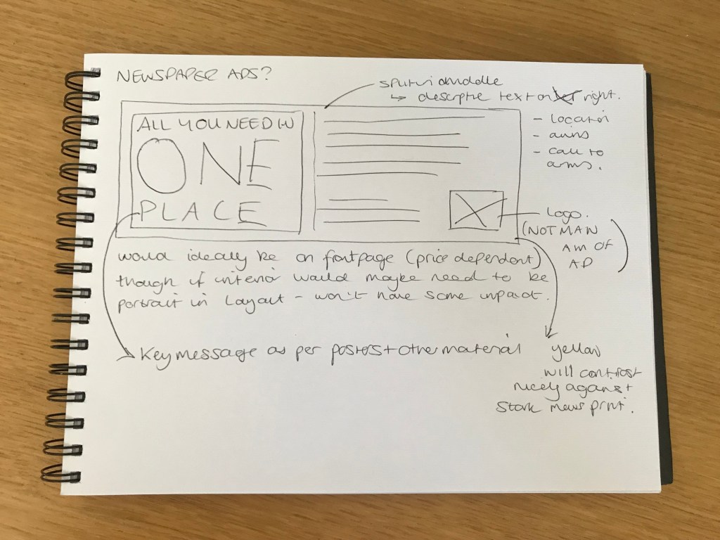
‘Given the global dimension of much of our food production and processing, food miles have become a way of assessing the environmental impact of our eating habits. A campaigning organisation wants to draw attention to food miles and the excessive distances the ingredients of a fruit salad on offer in a UK supermarket have travelled. They ask you to develop a linear diagram that plots each of its ingredients from farm to transport depot to processing factory to supermarket. For this campaigning tool you’ll need to think about how to prioritise the information to show distances travelled as well as the diversity of locations and stops along the way.

Distances are as the crow flies and have been calculated using Organic Linker’s Food Miles calculator: http://www.organiclinker.com/food-miles.cfm

Your fruit salad contains:

1 Bananas from Costa Rica – 5,424 miles (8727km)
2 Strawberries from US – 3,666 miles (5898km)
3 Grapes from Egypt – 2,181 miles (3510km)
4 Apples from New Zealand – 11,690 miles (18809km)
5 Oranges from Morocco – 1,254 miles (2018km)
6 Pineapples from Ghana – 3,176 miles (5110km)
7 Sugar cane picked in Jamaica and sent to Germany for processing – 4,683 miles (7535km) – before going to London 578 miles (929km).

The salad was made and packaged in a factory outside London before being driven to depots in Manchester, Cardiff, Birmingham and Glasgow, and from there to shops all over the country.

Create a design that either deals with a specific ingredient or provides an overview of where all the elements come from. As a campaigning tool, your designs need to be eye-catching as well as presenting key information. The client wants people to be shocked by the vast distance this food has travelled but doesn’t want to be accused of making false claims – so stick to the facts.’

I work with maps on a fairly regular basis in my day job, so the though of a map based task was not a particularly daunting one. The idea of producing an infographic style map for a very important issue had me itching to get started. The first step, in my eyes, was to decide on how I would present the information. To me the best way to do so was to use a ‘world map’ as opposed to one that localised the info to just the UK. This way I felt would have more impact on the viewer, as to just how far their food travels.

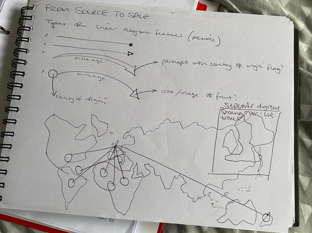
I wanted to use a type of linear graphic that would mimic the journey taken by the corresponding food. I initially explored the different ‘arrow heads’ or points that I could use. My first instinct was to use arrows to show the direction of travel, but soon realised that the arrow heads would become very messy and confusing when all converging on the same destination. So I opted with a simple point-to-point linear feature. I would then do a zoomed in section on the UK to show the foods’ onward journeys after landing on our shores.

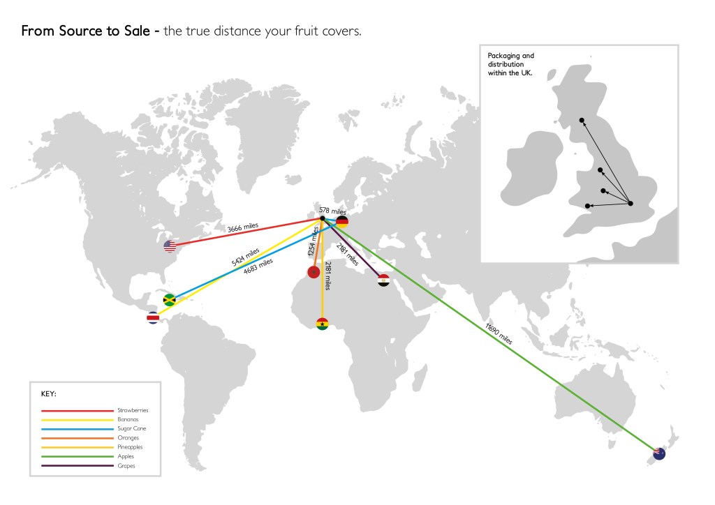
Above is the final outcome – I had initially thought of using some icons to demonstrate the individual fruit, but decided that as this was a serious topic, a more serious/professional approach was required. This led me to using a simple colour-coded key system, and the origin country’s flags to show the exact locations. I think you can get a good sense of just how far the fruit has travelled to reach our shops, and it seems shocking!!

Map Research

Maps are a fundamental part of our society, and they perform a multitude of different tasks, from directions for motorists, to touristic points of interest and everything in between.

The map in a traditional sense, is a physical drawn (or later printed) sheet depicting an area and its infrastructure. However, as technology has advanced, the map has evolved into many interactive and digital formats. Most commonly seen in apps such as Google Maps and other similar outlets.

Printed maps especially, tend to harbour the most in-depth detail as they can only be drawn once. However this can sometimes make it hard to find what, or where, you are looking for. As things have progressed, and the aforementioned digital maps have come to light, the information can be condensed and interactive. For example, at different zoom levels it is possible to have more or less information, streamlining it dependant on level of zoom. With these, prioritisation is not necessarily a concern, unlike on printed maps where a choice has to be made as to how much or little information to display.

Road maps tend to focus on roads and street/location names, for obvious reasons. However other, more simple printed maps can feature in things like tourist guides or holiday brochures, and can simplify the format in order to highlight the most important features of the selected land mass.

To increase understanding of maps (as they are usually used when someone is in an area unknown to them) colour coding or keys are often featured. Most notable examples of this are on public transport maps (London Underground for example) where the different routes are given their own colours, this helps to streamline the information to the viewer whilst minimising any confusion.

In summary, the evolution of maps has been a blessing for viewers, and confusion can now be a thing of the past due to the interactive nature of today’s digital world.

Step-by-Step Guides

‘A high street hardware store is developing a series of instructional guides to help their customers with some basic DIY skills. The client wants them to be accessible and easy to use for a non-specialist audience – so, for example, they mustn’t be too visually cluttered.

Develop a step-by-step guide for a DIY task you’re familiar with, such as preparing and painting walls, measuring and replacing soft furnishings, or putting together flat-pack furniture. Your guide can be based in the home or garden and should describe the activity from start to finish.’

Its BBQ season! The weather is gorgeous at the moment, and the BBQ is being wheeled out at least once a week. There was only one place I was going to take this task!

There was also only one obvious place for me to start and draw inspiration from – a certain Swedish furniture powerhouse…
A step-by-step guide, in my eyes should be as simple and easy to follow as possible. Meaning I think a lack of colour palette, and major detail is essential in order for the user’s attention not to be distracted from the task at hand.

Again, as with the last task, my first port of call was to begin to illustrate the BBQ on Adobe Illustrator, again keeping the individual components separate so as to demonstrate the order in which they go together.

Using our own BBQ at home as a starting point for the drawings, I studied how it went together, and to my surprise was a lot simpler than I first imagined!
Again I feel that the use of arrows really makes the focus easy to understand, whilst using cropped sections of the main image highlights exactly what section you are working on and how those components go together.

Household Instructions

‘A manufacturer of household appliances wants you to develop a new instruction guide for one of their products that describes its various components and their functions as well as providing basic instructions on use. For example, if you choose to produce instructions for a vacuum cleaner, you’ll need to represent the parts of the machine as well as explaining how to empty it or recoil the lead. Identify any safety elements you need to include in your diagram and use standard visual formats to portray them.

Think about how your user will know what each component is, how you describe any movements within the instructions, and the role typography plays within your instructions. It doesn’t matter if you’re not a confident illustrator; this task isn’t about drawing accurately, but about how you choose to present information. Illustration is just one option; you might want to use photography or explore alternative ways of communicating your instructions.’

In comparison to the previous task, I found this one to be much more enjoyable and better suited to how I work. My household object of choice was the humble kettle – used everyday, but they can vary a fair bit in how they are used.

After the previous research into aircraft safety cards, I was inspired to display my answer to this task in a similar way. This involved using a basic grid system for layout, and numbering to help identify which order to complete the steps in.

The first step was then to draw my kettle (as seen in the sketch above) on Adobe Illustrator. However, I needed to do this in such a way, that all of the individual components were separate, in order for me to easily demonstrate each section on my instruction card.

Once I was happy with the kettle illustration, I moved onto the card layout. I already had the idea in my head, so it was a relatively easy task to relay that to inDesign.

Again, I was very pleased with the final outcome for this task. I think I achieved everything I wanted to in terms of creating a clear set of instructions in an ‘aircraft safety card’ style. I also think the addition of the arrows and concise text work very effectively together.

Aircraft Safety Cards

The aircraft safety card as a piece of informative design, is perhaps one of the most universally used, yet also one of the most varied in how it gets its information across.

In terms of different aircraft, they don’t vary hugely, however between airlines, the design can look fairly different. Some choose to use numbers to direct the readers’ eyes around in the order they wish, while some use suggestive arrows to do the same job. You could argue that using arrows is perhaps the more obvious way to do it, and in the case of safety this is arguably the best practise. But from a design sense, do they arrows take away from the aesthetic…?

Using this Wizz Air example, we can see a muted colour palette, which as a result serves to highlight the most important points of the card. They have chosen to use numbers as a guide, though I feel they would need to be a bit larger to have the desired focus.

In contrast, this RyanAir card uses arrows heavily to illustrate which direction to do things in, and what goes where etc. A bolder colour palette means that the arrows stand out much more clearly than they do on the previous Wizz Air example. Sub headings also make the different sections clearly defined, leaving no room for ambiguity.

In my opinion this is the better of the two as it is far clearer to see what is happening in each section and which order to do things. The landscape (folded) nature also means more detail can be added.

Essential Ingredients

‘A research publication is running an article on our changing relationship to cooking in the home and what we consider essential ingredients. Researchers took a snapshot of what people had in their fridges and compared it to what people thought they would make with these ingredients. They were interested in looking at the kinds of foodstuffs we cook with, our reliance on pre-prepared food, and whether our attitudes to cooking are changing.

Using your own fridge’s content as a starting point, create a graphic representation that shows the relationship between the various ingredients. For example you’ll probably use milk for making tea or coffee. You might use butter, mustard and cheese for making sandwiches. And you’ll need all of these ingredients if you make a cheese sauce. How can you use Venn or Euler diagrams and/or the Isotype system to plot this graphically?

Don’t forget that this is a graphic design task not a maths exam, so be playful and visual in your approach.

You may want to do your own research into these three important representational systems before you start work on this exercise. Make notes in your learning log.’

So I actually found this task incredibly frustrating/difficult – I don’t have a mathematically minded brain, so trying to get my head around these graphs was a tough task! Nevertheless I had a go.

First off I made a list of the more essential ingredients in our fridge, and then tried to work out what I could make, using the majority of them…

The rough drawing in the top right was about the closest I came to anything that resembled a successful Venn/Euler diagram (research below)

The Venn Diagram is perhaps the one graph out of the three we were asked to research, that I had a vague idea about… The overlapping circles really being the standout/obvious choice for this task in my eyes.

So this was probably the most helpful image I could find, that could assist me in understanding the main difference between Euler and Venn diagrams. They are very similar, but this shows, visually the key difference.

The third type of graph/diagram we were asked to explore was an isotype diagram… After looking up what one was, it seemed pretty straightforward – using icons/imagery to denote a certain amount or volume of an object(s). However, I really struggled to see how on earth this could be helpful for the ‘what’s in my fridge’ equation here… It doesn’t appear to pull together any relationships between the ingredients.

With all that being said, I decided to stick to what I knew, and go with a Venn diagram to display my results:

Links:
https://science.howstuffworks.com/math-concepts/venn-diagram.htm
https://www.researchgate.net/figure/Euler-and-Venn-diagrams-produced-by-VennDiagramWeb-each-depicting-three-sets-x1-7-8_fig2_309067742
http://isotyperevisited.org/2012/08/introduction.html

The Working Week

‘Think about how you could represent your typical working week. You may want to categorise your time by what you’re doing (e.g. paid work, OCA work), where you are (at your place of work, at your desk at home) or another method. Try and represent your time proportionally. Develop your ideas through at least three different ways of representing the data. Reflect on how these different representations look. Are some more visually interesting than others. Are some more accurate? How could you improve your designs to make the information more interesting and engaging for an audience, while maintaining the basic proportion of the information?’

I started off by jotting down/working out a percentage of my time, per week, that I spend on things. This was a little strange/difficult at first because my working week (and pretty much everyone else’s in the country) at the moment is drastically different to normal – due to the ongoing COVID-19 crisis and many people off work or working from home. With this in mind, I could only work out a rough guesstimate of the amount of time I spend (in normal times) on certain tasks.

Once I had done this, I tried out a a few graphical ways to represent this data, firstly using the traditional (but apparently most effective) bar chart, and then two more of my own creations. Deciding that actually, all three were decent options, I subsequently turned all three into digital versions.

Super pleased with the outcome of all three, I think not only do they look visually appealing, they also demonstrate the data clearly – which is emphasised by the colour scheme I chose to use.

Local Relationships

‘Using either your own family history or a fictitious one, create a family tree using a pedigree or genealogy chart. Now use this family lineage to create a cartogram that plots where these family members were located. Look at some examples online if you’re not familiar with any of these ways of presenting information.’

The obvious place to begin with this task was to plot out my family tree. Luckily I had only relatively recently researched my own family tree, so the information was already to hand – a significant head start!

I then converted this tree to a nice, easy to follow digital format, as seen below:

We were asked to create a cartogram to display the location of each family member. However before this task I had no idea what a cartogram was! (a map on which statistical information is shown in diagrammatic form.) So I decided to research a few examples and see which style suited what I wanted to achieve, the most.

After viewing a few examples including the above, I settled on a simplified version of what I understood a cartogram to be. Using overlaid circles of differing sizes to highlight the locations of the family members, and also the number of members in certain areas.

As you can see, a very simple version, but I think it displays the key information in an easy to digest way. I feel it could have been more interesting, but most of my family have all originated from the London/South East area, meaning that there wasn’t too much diversity in the cartogram itself.

Links:
https://www.data-to-viz.com/graph/cartogram.html
http://metrocosm.com/how-to-make-cartograms-with-animation/

Save Our High Street

The final project for assignment 3 – to develop visual material for a campaign to get local people to shop within their community. Choosing my own village Hartley as a real world example, I identified 4 shops which would really benefit from a larger local customer-base: Glovers Farm (fresh meat and veg farm), Hartley Supplies (DIY shop), The Gearbox (local car parts store), and Bottle & Basket (alcoholic and non-alcoholic beverages). Together they cover a broad amount of the market, meaning that people can get the majority of their ‘needs’ all in the one village – in which everywhere is walkable.

After I had identified the shops and the key messages behind why people should choose them over driving to an out-of-town superstore, I then began to think about what sort of visual material would be suitable for the campaign. It all needed to be relatively inexpensive, yet effective in drawing in both young and old. As you can see in the scans of my sketchbook above, I came up with a fair amount of different material, both printed and digital. The first step however, was to come up with an ‘umbrella visual identity’ for the campaign. I came up with a couple of options, but my favourite, and the one I think portrays the message a clever, yet easy to understand was ‘Focal on Local’. It encourages a focus on the local community. I then I had to design a logo/identity, wanting it to stand out within a village environment I decided it needed to be quite bold and eye-catching, thus using a heavy font and bright colour scheme to really stand out and perhaps contrast against the quiet, reserved nature of village life.

After deciding on the visual direction that the campaign would head in, it was time to make a start on the rough designs for each of the aforementioned pieces. The whole process is documented in the ‘Campaign Presentation Document’ attached in my submission.

Pastiche

“an artistic work in a style that imitates that of another work, artist, or period” – this is the dictionary definition of a pastiche. It describes exactly what a pastiche is, but it doesn’t give the wider context. A pastiche then, I believe is something that is often used to portray a message, either through imagery and/or text. Some people may argue that a pastiche piece of art is plagiary, and there is an arguement for this – you are taking somebody else’s design and using it for yourself. However, I think the way in which a pastiche takes the original message and changes it to suit the new one, transcends any plagiary. It takes a lot of originality and creativity to produce a successful pastiche, and could be argued is almost harder to achieve, than starting on a blank canvas.

With this in mind I set out to produce a pastiche of my own, which tackles the current global issue of the Coronavirus or COVID-19 pandemic. At the time of writing most of the world is in some sort of lockdown, and a general 2m ‘social distancing’ rule is in place. But the longer this restriction goes on, the more frustrated and fed-up the general public are, and will, become. My pastiche then, will aim to reflect this feeling, but also advice/encourage people to stick with it for the time-being, in a sort of ‘tough love’ kind of style.

My initial thoughts as to how best to portray this immediately lead me to thinking about faces, and face coverings which are becoming ever-increasingly used to protect against the spread of the virus. My searching then lead me to various famous prints/posters, predominantly music based, where the face is the prominent feature. However the one which stood out to me the most, and I feel can be used as part of a successful pastiche is the below Nirvana poster:

Although the true origin of the ‘x-eyed smiley’ motif are unclear, the generally accepted consensus is that the group’s iconic frontman Kurt Cobain drew it. The meaning behind it is also not defined, but again is generally accepted to be a symbol of defiance against the manufactured music of the time – “But what was the significance of the smiley face? Obviously based on the black and yellow smiley logo that had become popular in the 1970s, then became subtly subverted by the acid house craze in the late 80s, the image was obviously a comment on the inane, manufactured pop music that Nirvana and other grunge bands were kicking against.”https://www.radiox.co.uk/artists/nirvana/what-does-the-nirvana-smiley-face-logo-mean/

Above, you can see my thought process into how I could develop the existing icon into my own pastiche, using the face mask as one of the key features to give perhaps the most obvious visual change. Other tweaks I thought of included visually demonstrating the 2m rule, as well as a clever play on words with ‘NERVEANA’. Below you can see the finished outcome:

Design a site like this with WordPress.com
Get started