Graphic Design in Campaigns

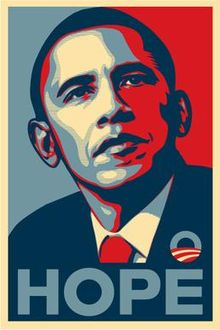
After being asked to identify some ways in which graphic design has helped to support campaigns, my mind immediately thought to the iconic ‘Hope’ poster of Barack Obama’s successful 2008 presidential election campaign. Designed by Shepard Fairey in just one day, it was originally distributed as a simple street poster, but soon became a symbol of the campaign, with the wording at the bottom being interchanging between the key messages of the campaign – hope, change and progress. It consists of a stylised  portrait of Obama in solid red, beige and (light and dark) blue, the colours representing the colours of the United States’ flag. Evidently a hugely successful campaign culminating in the election of Obama to POTUS. 

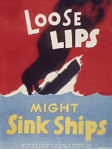
In addition to this, well designed and thought out propaganda posters are also hugely effective. Perhaps one of the most famous is the “Loose Lips Sink Ships” poster used in the Second World War by the Americans. It was a campaign to stop people discussing things in public, as enemy spies were thought to be everywhere, and may pass information back to the Axis enemy powers. Again we see a simple, yet bold message, something that is easy to digest, and can be read even at a glance. The powerful imagery of the warship sinking is used to hit home to the public, what they’re carelessness could lead to – a type of mild shock tactic. Designed by Seymour R. Goff in 1941, it played a very important role in keeping the country safe.

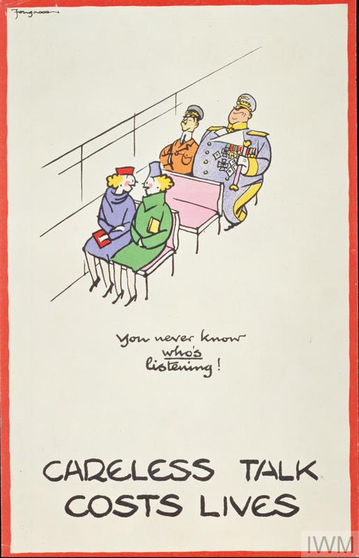
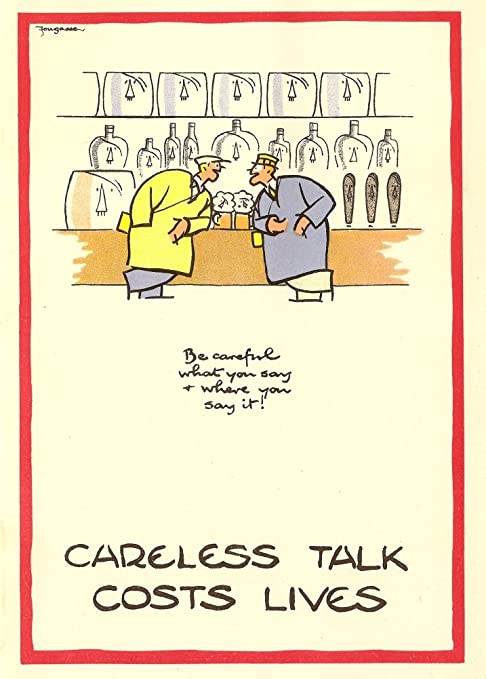
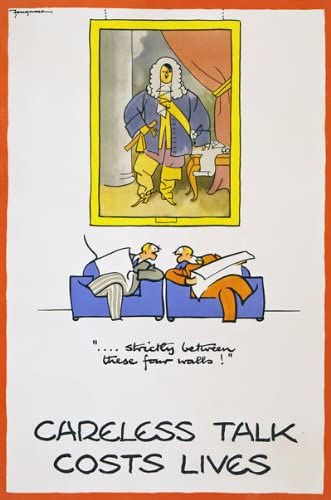
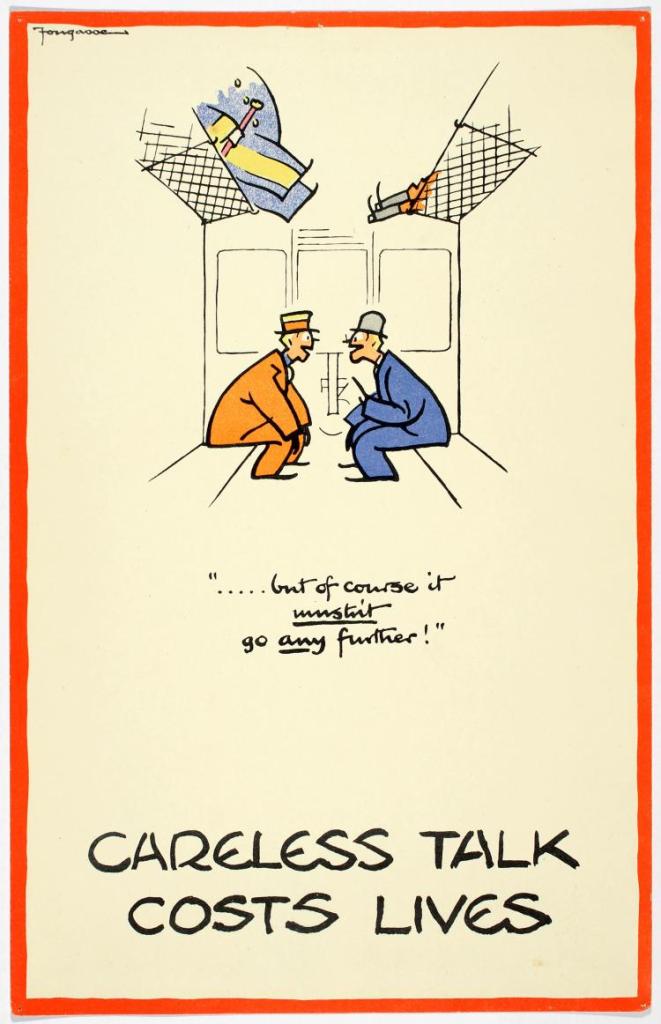
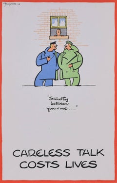
Other very similar campaigns existed throughout the Allied and Axis nations during the conflict – another example being the British take on the same message. “Careless Talk Costs Lives”. Again, short and to the point as it aims to get the message across to people quickly. But unlike the American version, the series designed by Fougasse are slightly humorous and tongue in cheek which would most likely resonate better with the British public. They depict two members of the public chatting to each other, seemingly unaware of would may be listening in. In all of the posters however, background objects or people are made out to be caricatures of Hitler, or his upper echelon staff such as Goering etc, to show who may be listening in. Humour isn’t a strategy one would expect with propaganda or campaign style posters, but is something that I think works particularly well here and shows a great understanding of the target audience.

Iconic Brands

For me, brands don’t come much more iconic or recognisable than Adidas. ‘Die marke mit den drei streifen’, the brand with the three stripes is iconic in name and visual features. The three stripe motif that has been consistent from the beginning is a nod to the running track, and the lanes athletes compete in. It has evolved from a pure sports brand, to be an all encompassing sports lifestyle brand. This hasn’t however, altered the brand’s image much at all. In fact the overall image has changed very little in the brand’s existence. The predominant focus of the brand is still very much on sportswear and providing cutting edge technologies for athletes at the top, top level.

In the early decades, the brand’s focus was very much on developing perfect tools for athletes and footballers – the 1950s-1970s were all about trying to be the best in the field for sports wear – predominantly footwear.

However in the 1980s and 1990s we see a shift in the brand’s focus. Sportswear still remains a constant, but the introduction of a fashion element starts. Initially with music and Run-DMC, the brand’s image becomes much more than a pure sports brand. It becomes a lifestyle brand. The 90s continue this trend as we see EQT collections in fashion (based on sportswear) but also the development and introduction of the first Predator football boot which really revolutionised football.

Off the back of this success, the 2000s bring a much higher profile to the brand. Global megastars like David Beckham become brand ambassadors and the brand’s global appeal and reach becomes stratospheric. This paves the way for high end fashion collaborations which take the brand all the way to the present, with people like Stella McCartney and Kanye West bringing the brand to an all encompassing sporting/lifestyle megahouse.

Visually however, the brand’s identity has largely been consistent throughout. The three stripe motif being ever present and the blue colour scheme remaining in place since the 1960s. Advertising campaigns have differed slightly, but only pushed by the change in the world, as opposed to any brand identity shift. I think this relative strictness in terms of keeping the brand consistent has served Adidas extremely well, and it is instantaneously recognisable worldwide. I think there is definitely something to be said, for minimal changes, in comparison to complete brand overhauls which some brands undertake. But again that is largely due to having a very strong starting point for the brand, and one that survives the ages.

Supermarket Packaging

Supermarkets these days seem to sell food from all corners of the globe. But how are they able to do this, and still make sure that each product is recognisably from their respective supermarket? The answer is a strong brand identity. Packaging can be wildly different from product to product, but things that remain consistent are things such as logos, typefaces and colours. For example, Sainsbury’s ‘Taste the Difference’ range all features purple accents on the packaging, thus tying it all into one range and supermarket. The serif font also promotes a sense of quality and sophistication, in contrast to their basics range which is very stark and plain in terms of design, using white and the orange of the Sainsbury’s brand, with a basic sans serif font. The SO Organic range, again, has its’ own sense of identity – Cleverly featuring the ‘S’ of the Sainsbury’s logo in the signature typeface and colour, so give a subtle nod to the supermarket brand. Throughout their ranges, the subtle keys such as the ones mentioned above, help the supermarket to maintain their overall brand image across almost all of their products.

21st Century Zoo

I was asked by a local wildlife park to develop a logo that supports the idea of a popular and fun family-centred experience, but that also helps to make people more aware of the conservation work they do. I chose an animal that is both endangered and hugely popular with a family audience – the Panda. Below is my initial sketchbook thoughts and sketches on the subject:

In order to distinguish my logo from existing panda-based logos, I decided to concentrate purely on the animal’s face. This is in contrast to the logo used by the WWF (World Wildlife Fund).
I had one idea to utilise the black and white colour scheme of the animal, and do a logo using negative space, however after sketching that out, decided it wouldn’t be friendly enough for the task at hand.
So I subsequently decided to include facial features, including a smile, which gives the panda a semi-human quality, and makes it have a much more ‘friendly’ feel to it. To fill the dead space between the ears, whilst retaining a circular shape, I decided to give a hint towards the animal’s natural habitat and food source – bamboo. It also enables me to add a splash of colour to an otherwise, monochrome logo.
And finally, to really describe what the logo represents, some text following the circular shape, is added to the bottom right of the logo – thus identifying the animal and the wildlife park/scheme.

Evolving Logos

For many corporations, their logo often defines the brand, and without it simply wouldn’t be recognisable. How then, does a company or corporation go about changing, or ‘modernising’ their logo and image? I have identified a couple of well-established organisations that have done just that:

Visa – Although not the most detailed or intricate logos to begin with, the Visa logo has undergone a few changes in the last few decades, eventually losing the ‘card’ emblem, and blue/yellow theme, in favour of a purely type-based logo, or logotype. The font has changed very little, but the yellow features have now gone entirely, which follows a trend that is in action worldwide.

Pepsi – The Pepsi logo has undergone a number of pretty drastic changes in the last century. Starting with a cursive/script based logo which then made its way onto a ‘bottle cap’ motif in the mid-40s, where it slowly modernised to keep pace with the rapidly modernising world. The red and blue cap, with the white wave through the middle, became the company’s identity, and it something that has remained consistent since the 40s when it was introduced. In 1975 the cursive font was ditched in favour of a clean, bold sans serif font, instantly easier to read and recognise. This remained until 2005 when shadows and highlights were added to create a sense of depth and realism to the logo, the font also shifted to a modern (at the time) italicised, almost futuristic font. Again this remained in place until the present logo, where we see an entirely new take on the original ‘wave’ bottle cap feature, as well as another new font – this time all in lowercase (another notable trend of late). There is still a subtle nod to the original wave within the ‘e’ which is a nice touch and within keeping of the brand’s heritage. Another simplification occurs, and the shadows and highlights are lost, as well, everything is flattened in order to become more user friendly.

Volkswagen – The German car manufacturer Volkswagen has undergone a number of logo tweaks through the years, however the main feature ‘VW’ motif has remained throughout. Unlike the other brands mentioned though, with the latest instance VW have looked to their past for inspiration. Moving on from the depth, shadows and gradation of colour, to a very simplistic and flat roundel which VW say is to take the company into the new electric era. The motif remains the same, but for the first time, we see a reduction in the weight of stroke used, perhaps making this the most dramatic shift in recent times.

As we can see, the general trend with all three logos, is the gradual simplification that occurs, especially once we enter the current phase of each logo. I believe this flattening and simplifying is to cater for, and assist use within a broader usage. Whereas logos in the past were generally printed only, nowadays they appear on a wide spectrum of ephemera – from printed, to digital, and huge scale right down to very small. The logos now have to work in all spaces they are required, and the easiest way to achieve this is by simplifying forms, and limiting colour palettes. This is a trend that is happening on a global scale, very rarely now do we see logos with such intricacies as we did in the past.

Logotypes

Tasked by a confectionary company to present some rough ideas for a new range of chocolate bars, this post will present my thought process and development on the way to producing some basic initial vector graphic logotypes. The three ideas which I had to develop were:
Aztec Gold – Exotic dark chocolate with buried fragments of honeycomb
High Tea Biscuits – An altogether classier chocolate biscuit
Pow Milk Bar! – Retro chocolate for big kids

Below are my initial thoughts and sketches as documented in my sketchbook:

Using these pages and sketches as a start, I began to think which version would work best for each bar, and once a decision was made I developed them into vector logotypes as presented below:

Aztec Gold: The thinking behind this was to have a playful dynamic to the wording, so having the letterforms on different levels, whilst maintaining a togetherness. The internal pattern reflects similar used in traditional Aztec designs, and also adds a hint to the dark chocolate nature of the product. And finally the heavy serif font also gives a nod in the direction of typical Aztec styled fonts in popular culture.

High Tea Biscuits: With ‘High Tea’ I took the literal sense of the word high, and made both versions demonstrate this in different ways. With the first, the ‘H’ and ‘T’ are tall, emphasising this. The serif font is also a subtle hint towards the classy nature of the product. In version 2, I opted for a tall, narrow sans serif font, as they can often be more favourable in the current design ethos in the world. A stacked logo, also adds another dimension of interest, and is a new take on traditional chocolate bar packaging, which is predominantly landscape in form.

Pow Milk Bar!: A heavy, bold font here is used to give a sense of onomatopoeia to the word ‘POW’. The gradient colour scheme implies the retro stylistic nature of the chocolate bar, the orange/yellow scheme hints at popular colour schemes from the 70s/80s. Further to that, the addition of the star within the ‘O’, adds another layer to the design, giving it more depth. Potential to be displayed with or without a boxed border, depending on the usage or format in which the logo is being used.

Assignment 2 Reflection

What have I enjoyed most, or the least, and why?
I think the most enjoyable part of this section, for me, was the final task, the freedom to design a pamphlet in the layout I wished, with content that I chose myself was quite a liberating task, and coincidently I think is also my most successful work in this section, form a design perspective.

Have the exercises helped me to think about things in new ways or try out new ways of working? What have they been and how has your viewpoint changed?
Most definitely! I think the penultimate task, the Altered Pamphlet definitely forced me to think and work in a way that is something a little bit outside my comfort zone. But one that I enjoyed, and think achieved a good degree of success with. As a result I would feel much more comfortable in working in a similar fashion in the future, and to good effect. It has definitely broadened my thinking in terms of physical ways to approach a brief.

What area(s) would you like to develop further?
I still feel that my contextual research is probably lacking some depth, and maybe just skims the surface of what I could be looking at. So this is definitely something to consider and focus on when progressing through the course and into the next phase.

Satisfying Typography

Taking the below poster for the Red Hot Chili Peppers 1986 tour as an example of typesetting that I find satisfying to view… My reasoning for this particular choice is that the type fits around the focal point, adding to the design as a whole. It goes somewhat against what Beatrice Warde’s argument suggests – that the text and information takes precedence over the design. In this case I feel that the two elements actually complement each other and a nice balance between design and information is struck. The psychedelic style of font allows for the form to be fairly fluid, thus all the information is present, and legible.

In stark contrast to the above, is an A5 two-sided leaflet I picked up on a recent trip to Riga in Latvia. The leaflet was advertising and contextualising a small exhibition being held in the National Library there. The front of the leaflet is what initially caught my eye. A very simple design, using an optician’s eye chart as inspiration, the exhibition entitled ‘Gramata Latvija’ (or ‘Book in Latvia’) is repeated on the front, getting smaller towards the base of the page. Not immediately easy to ascertain what is being portrayed, it enables the reader to delve further, which is when you turn overleaf and are greeted with a very clean three column layout in which the exhibition is explained in full. As stated I chose this piece, as I not only liked the style in which it was being presented, but also that it is in stark contrast to the poster above. Two very different examples of how type can work as the focal point or alternatively, with the focal point to good effect.

Newspapers vs Websites

Starting with the Financial Times as a publication to focus on, I looked at how the website and physical paper compare. Firstly, the webpage: One of the first things I noted with the webpage that differs from the newspaper is the copy font. In the newspaper, a traditional serif font is used… however in digital form a more basic sans serif font is used, this is presumably to do with optimising it for web/screen, as it is far easier to read a sans serif font this way. In terms of things that were immediately similar, the obvious heading font was clear, to tie in the brand. Layout-wise though, the website obviously plays out differently, traditional columns are scraped in favour of user-friendly bitesized subheadings and an image which lead to the full story. Adverts are also prevalent, often in strips (vertical or horizontal) and fit in alongside the text, so as not to overpower the information. Similar to the main publication, the main or more important/breaking news articles are often bigger and in more dominant spaces, with smaller, ‘filler’ type articles down the side or in their own section. This helps the reader to decide which is the more important read, and to digest that first before making their way down the page/site to the next story. Everything seems ordered and tailored to this end.

Envelope Patterns

After exploring a few different patterns, each of varying style and colours, I decided that the most successful, in terms of doing the job intended – is the below:

The combination of highly contrasting colours and a heavily repeated pattern, means that any information inside the envelope will be properly obscured. Its also a pattern that lends itself to a multitude of colours, which is ideal when being mass produced for a brand.
A close second was this effort:

With added ‘layers’ through shadows etc, the obscurity is still present, but larger ‘blank’ areas mean that some may still appear, and that’s not ideal. Colour-wise it generally lends itself to a darker tone, thus limiting it’s appeal on a mass scale.

Design a site like this with WordPress.com
Get started